Article
Mar '13
Time for a redesign?

Tom Bradley
Related services
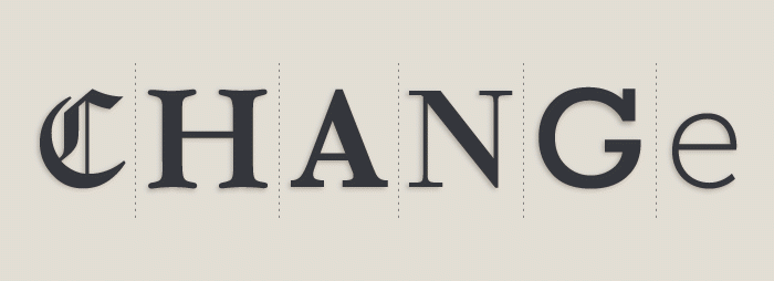
Your logo is the voice of your business, it immediately paints a picture about the way you work, who you work with and where you sit within the marketplace. But what do you do if your marketplace itself takes a new direction? Do you keep up with the times or risk standing still? We've gone into some detail about the considerations, trials and tribulations behind redesigning your logo in an effort to help those who think they're in danger of becoming, visually, a bit long in the tooth.
You might think that having the starting point of an existing brand would give your designer a helping hand but this can actually make things more difficult. The reason for this is that we would now have to consider which elements from your existing brands are important. Is it your colour that makes you recognisable and would altering your icon cause rioting in the streets from a mass of loyal customers? When starting from scratch there's more freedom whereas loyalty and like-ability are now at stake. Take high street fashion chain 'GAP's recent logo redesign as a good example - just days after the release of their new image unpopular demand caused them to retreat back to their original icon.
There are of course many examples of famous redesigned logos that have proved a massive success and this is why we're writing this post.
So why do I need to redesign my logo?
There can be many reasons why you might want to consider changing your logo. Some of the main ones are:
We've changed.
If your business has switched direction, has introduced a new major product or has recently merged with another and the company's vision has changed as a result, then your brand might require a refresh to make this clear.
We're the same.
Have you noticed that someone else within your sector or within close proximity has similar branding to you? If so you'll want to avoid any confusion by regaining a unique brand.
We're not quite right.
Are you having technical issues with your current logo? Perhaps your mark features too many colours and reproduction is a costly pain. Maybe the shape of your icon needs tweaking or you'd like to introduce some sub-divisions to your business which each need a clever version of the parent company's branding.
We're mingin'.
It might be that you're having to change to be more in-keeping with current trends. If so we can help to revitalise your logo and bring it well and truly up-to-date. Ensuring your image is current will help portray your company as dynamic and forward-thinking, not to mention less of an eye-sore!
What should I consider first?
Before going ahead with a rebrand there are a few things to consider. Firstly it's important to remember that updating your logo means updating it everywhere… Using the old logo in any instance once the new brand has been launched will create confusion and make your organisation appear sloppy. This can be expensive for larger organisations and can take some time to roll out. So before your new logo is exposed to the public make sure you're ready to replace the logo on your website, your van graphics, your stationery or your branded aprons.
Whilst you're thinking about a rebrand do you also need to consider where your logo is going to be used in future? Do you need a different version for your website or your mobile app? Are there going to be colour restrictions when the logo's reproduced on the new uniforms you're thinking of ordering? Thinking about these applications from the start will allow us to produce the most suitable and successful logo for you going forward.
Your updated logo will want to work seamlessly with your marketing in whatever form it might take. This includes your colour palette, the typefaces you use and the imagery that accompany them. You may want to take guidance on this from the design team or you may want to undertake these future designs yourself - in which case you should consider commissioning a brand guidelines document to help you make the right decisions when applying your logo.
Where we come in...
At Root Studio we have worked on a variety of successful rebrands, most recently including new identities for the GLNP, Just Lincolnshire and Clarriots Homecare. From our experience logos can be redesigned to different levels, from slight tweaks to complete re-imaginings but above all we specialise in creating quality brands that are well considered and will stand the test of time. So much so that one of our more well-known rebrands for EPIC Lincolnshire was featured in Michael Hodgson's 'Recycling & Redesigning Logos' available in any good book store ;)
The design of a new logo can be underrated by some but hopefully this article goes some way to explaining the thought that goes into our concepts. Above all we want to ensure that your new logo will be as powerful and as useful to your business as it can be, whilst remaining true to its roots and not forgetting it's loyal audience.
Thanks for reading
For more news follow us @rootstudiouk
Similar posts
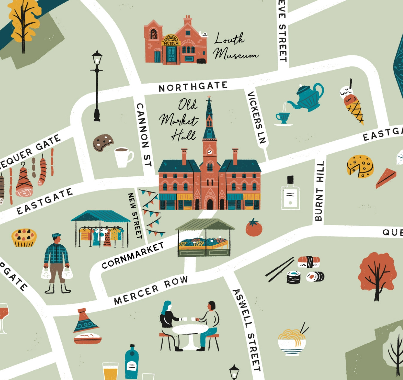
Illustrated maps can capture the essence and personality of a place, embodying its character and charm in a visually captivating way. In this article, we'll delve into the many considerations that you and your designer should make whilst crafting your illustrated visitor map.
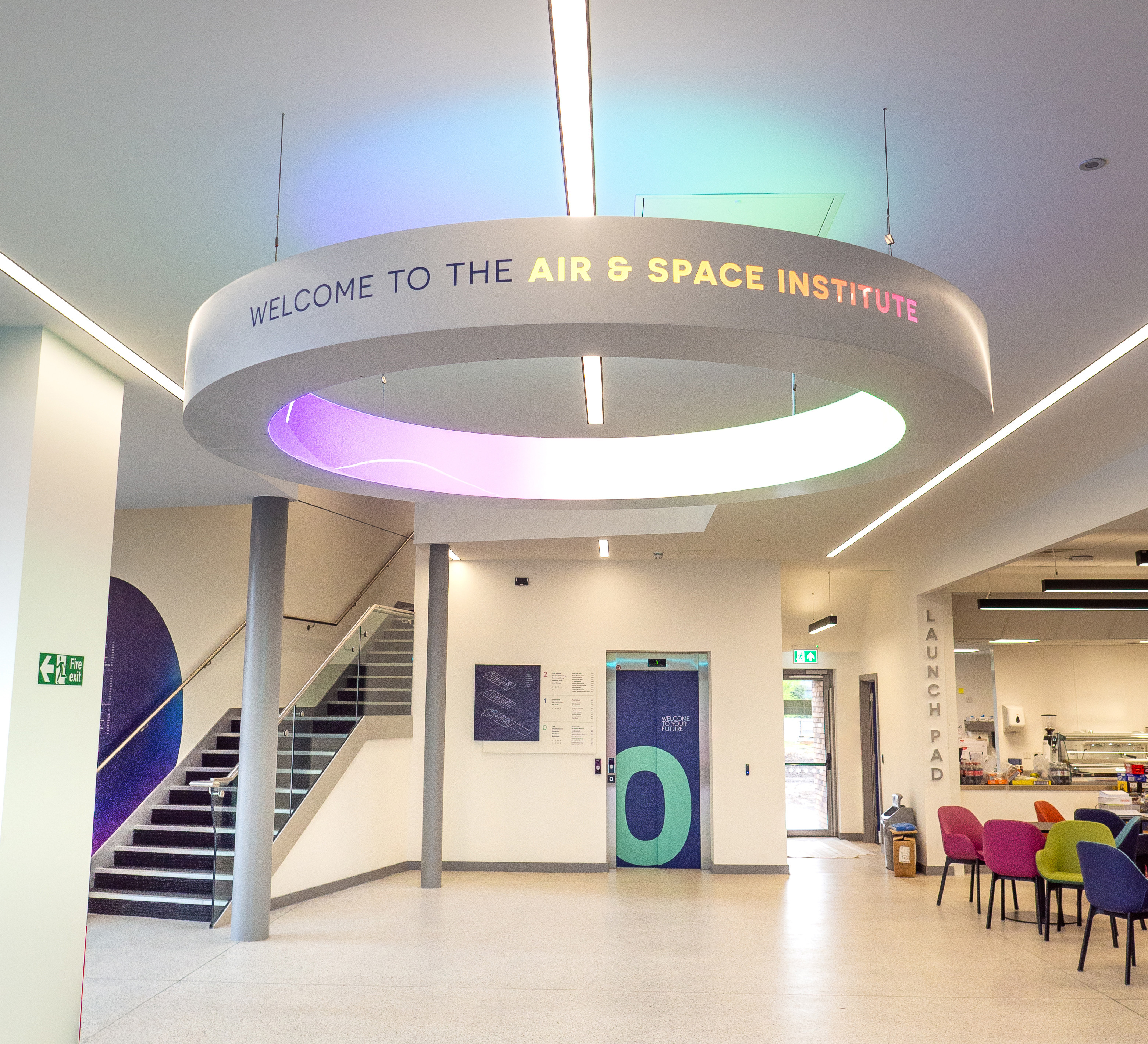
In recent months we've been working with the Lincoln College team behind the scenes at the development of their groundbreaking ASI campus in Newark to develop a cohesive and innovative collection of signage and wayfinding graphics for students, visitors and staff of the site.