Article
Sep '14
Our recipe for marketing your restaurant (successfully) - PART 3

Tom Bradley
Related services
This is the final portion of our guide to marketing your restaurant (successfully). Those of you who have followed this short series will hopefully have already taken away some great points to apply to your business - but wait there's more...
Last week we looked at your restaurant's online presence - from website design to online marketing. This time we're focusing our attention on building brand loyalty in a world of stiff competition, we're also diving into the science behind your restaurant's menu design.
Competition
Go to trade events and visit other restaurants, find out what the trends are and see if they have a place in your business. Getting inspiration from other restaurants isn’t cheating as long as you put your own spin on things. Take a look at their menu, pick up their flyer and take note of what they’re up to on Facebook - friendly competition is healthy for your business so look at what they’re doing and if it’s working - see if a similar idea could work for your business and take it to the next level.
On the flip side, while you’re looking at what they’re doing, think about what they’re not doing. Is there a niche that your competitors aren’t catering for (if you excuse the pun), is there a gap in the market that you can exploit? Try to think differently to others, write a list of everything your competitors are doing and alongside it write a list that’s the polar opposite - you might hit gold.
While you’re at it, why limit your research to other restaurants? It’s likely that there are other brands in other sectors that share the same values or styling as you - see what they’re up to as well.
Building brand loyalty
After you’ve worked so hard to find new customers your next challenge is to keep them coming back. You should support and reward your customers in order to keep their loyalty. Whilst offering dramatic discounts to new customers in an effort to entice them into their first visit might seem like a good idea at the time, it could be considered short-sighted. After all you’re setting a precedence for über-cheap prices that you can’t possibly maintain so they’re unlikely to revisit until the offer runs again. Besides which, you’re also devaluing your product - people will assume that if you can cut the price dramatically and still turn a profit then the original prices on your menu are a rip-off. Instead focus your discounts on repeat custom through loyalty schemes and rewarding those that follow your day to day activities on social media.
Keep people interested by updating your menu on a regular basis, by all means keep some of your best sellers on there (or remember them for this time next year) but if a customer eats the same meal at your restaurant each time they’ll inevitably get bored. Mix it up with some seasonal specials that you can up-sell to them next time they visit, and before they leave mention what you might be adding to the menu next month.
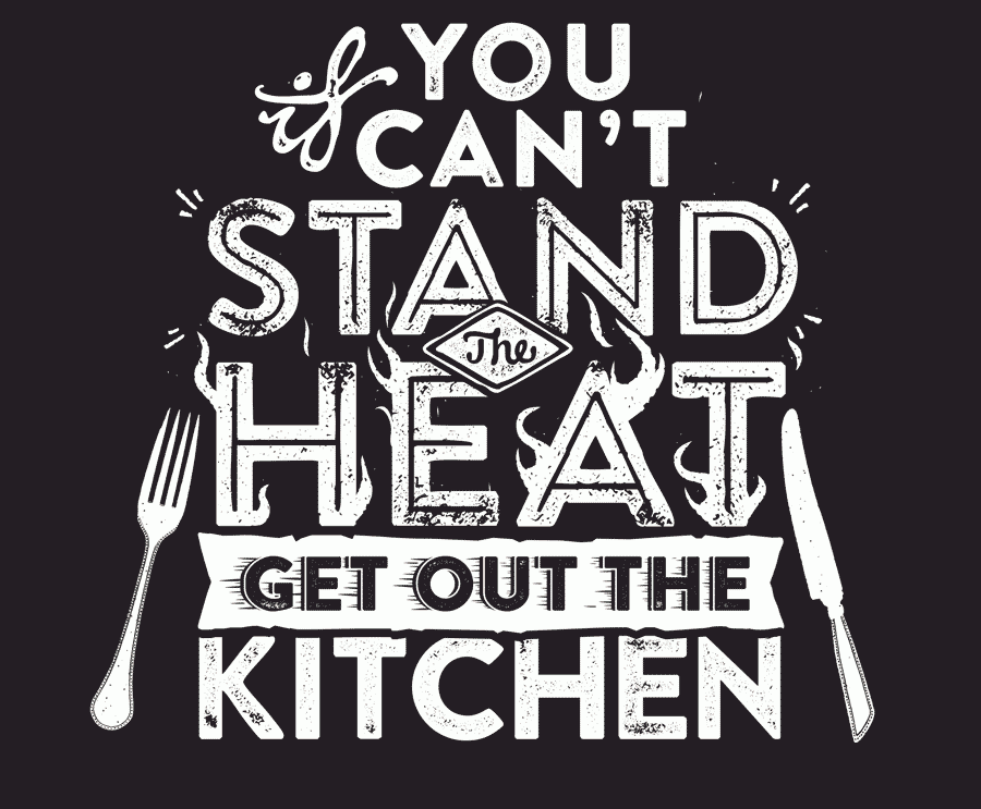
Menu design
Your menu is an important sales tool in itself, it showcases what you have to offer, what you stand for and who you are as a business. Other than the dishes themselves there are other elements to consider such as the weight and size of the paper, how it’s bound, the styling, use of photography and the tone of voice. All of these things should be an extension of your restaurant’s brand.
The science behind menu design
For many years designers and restaurant owners alike have been designing their menus under an assumption that the reader’s eye is naturally drawn to the upper right hand corner of the page (therefore an ideal place to drop in your specials or your more pricey menu items). However, more recent studies have suggested that a menu is read more like a book, from top left downwards then likewise with the right. Whichever studies you believe, one thing that is clear is that items placed in boxes or listed in a different colour will interrupt the reader’s attention and appear more important.
Getting your language right is also important. Listing dishes in French or Italian for example will make the menu appear more authentic and accompanying the name with a short description of the flavours and presentation will help readers get an idea of the taste. But be wary - go too far and you risk looking pretentious. Likewise if the tone of your menu is friendly and straight to the point you will make your diners feel more relaxed and at home.
Menu choice
Keeping your menu short can have several benefits for your business and your customers, you’ll make the decision making process much easier for them and you don’t have to keep as much stock. If your menu does offer a wider range of choices, try to split your food into categories and in a logical order (starters, light meals, mains & sharers, desserts).
Research has suggested that there is an optimum number of dishes per category that you should list on your menu. For fast food restaurants it’s six per section whereas at more sophisticated a la carte restaurants diners prefer to see seven starters and desserts alongside 10 main courses.
A large menu selection shows a lack of focus (confusing your diners), takes longer to order from (slowing down turnover) and requires more inventory (keep your larder tidy and keep your profits high).
Photography
Try to avoid the use of too much photography within your menu - by all means use a few high quality photographs on the cover and depicting your finest dishes (again, we’d suggest hiring a professional for these) but too many images can cheapen the look of your menu. If it fits with your branding an alternative would be to use illustrations or quirky typography to liven up your design (we can help there).
Health information
More and more people are wanting to keep an eye on what they’re eating. They’re interested in knowing where your ingredients come from, whether they’re organic and how many calories they’re taking in. By listing this information on your menu together with options for lighter meals you’ll be equipped to meet the needs of a growing health-conscious population.
In fact, as of the 13th December 2014 UK law is changing, affecting all businesses selling food. From this day all allergens found in your dishes must be made clear to consumers. We’re working with MenuLab to provide a service to help work out these allergens, take a look at their site if you need help.
Pricing
I’m not going to start telling you how much you should be charging for your food, but an interesting study has suggested that if you remove the ‘£ ’ sign from your menus altogether your customers could spend significantly more. Maybe this would be worth a trial of your own, instead of listing your food as £12.99 try 12.99 instead and see how it effects the pass. Just remember to include a note somewhere saying ‘all prices are in pound sterling’ otherwise someone might want to swap 12 magic beans for the lasagne.
Curve-ball ideas
Join forces with another nearby restaurant to combine your marketing efforts into something more substantial and eye catching.
Include a ‘secret menu choice’ only available when a customer orders using a certain phrase or follows your twitter feed avidly. “I’ll have the green eggs and ham please”.
Ask your loyal customers what rewards they would like to receive, this will make them feel connected more closely to your brand and shows that you care.
Show your customers how you interact with your suppliers. If you’ve visited the local market to source some ingredients - take a selfie with ‘John, the butcher’ or ‘Sue, the fishmonger’ and blog, tweet and Facebook about your visit.
Give us a call!
We hope that we’ve offered you some interesting ideas that you can use to improve your marketing. If you would like to discuss how any of our ideas could pan out for your business then get in touch, we’d love to hear from you!
Thanks for reading
For more news follow us @rootstudiouk
Similar posts
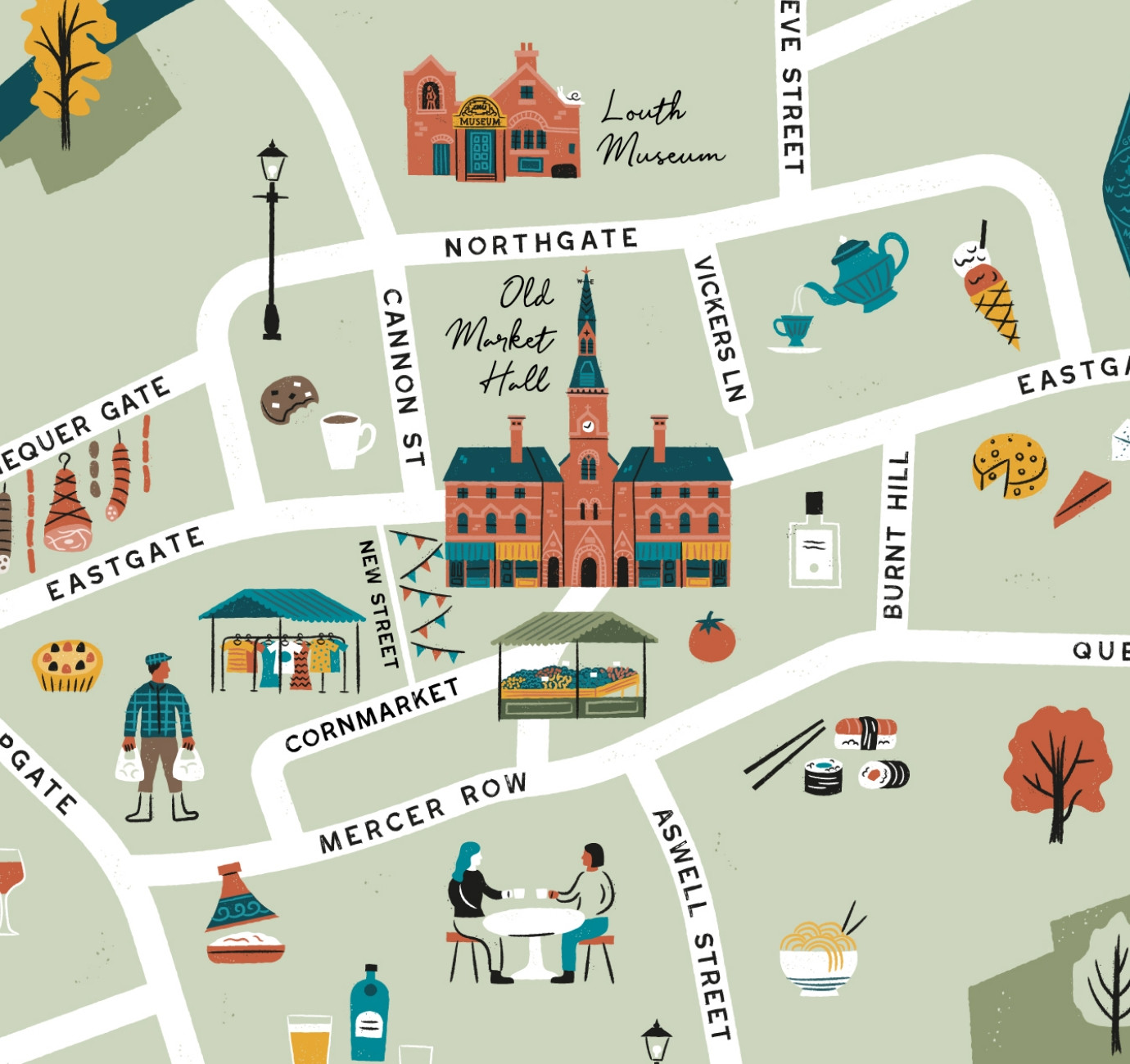
Illustrated maps can capture the essence and personality of a place, embodying its character and charm in a visually captivating way. In this article, we'll delve into the many considerations that you and your designer should make whilst crafting your illustrated visitor map.
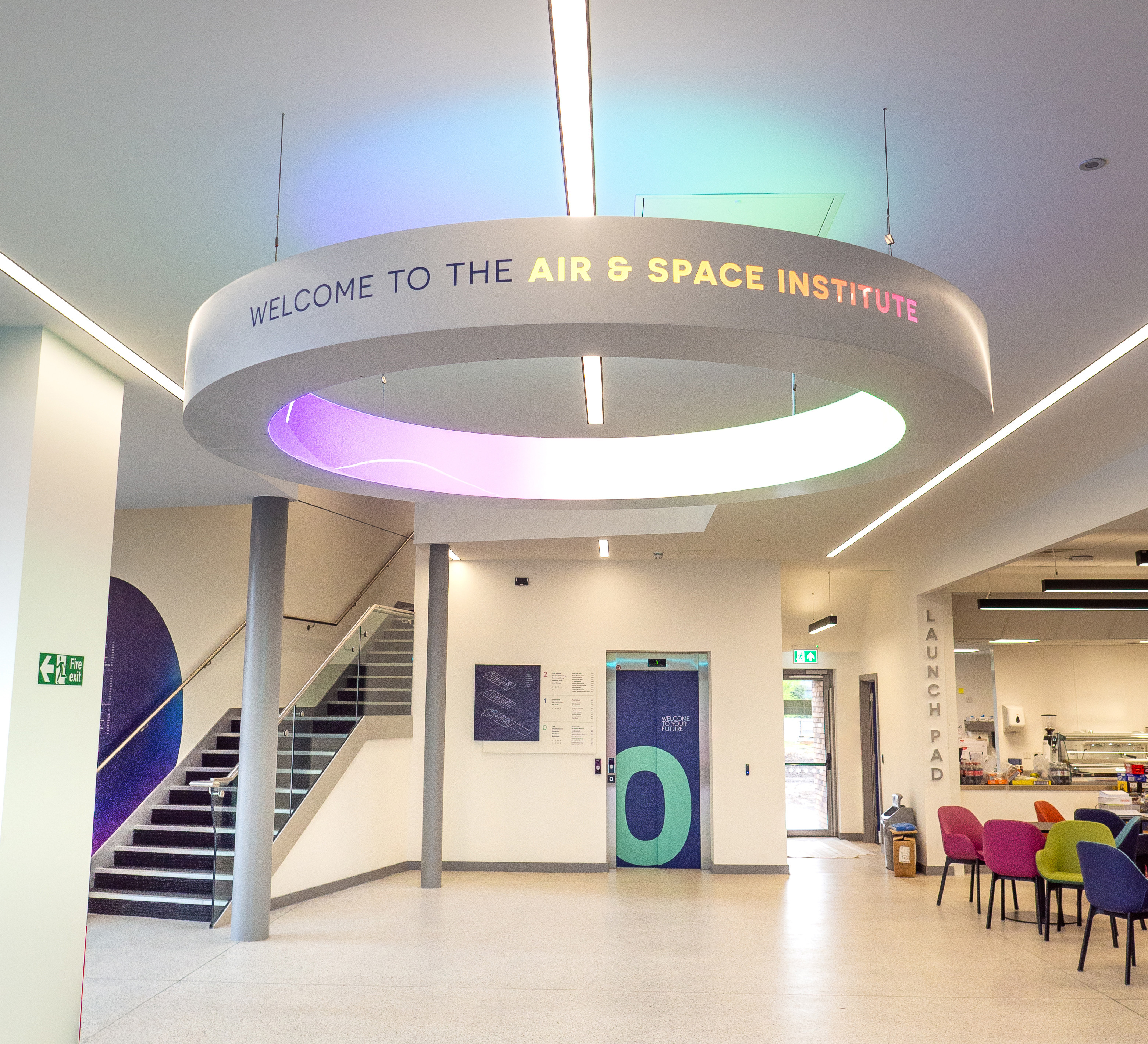
In recent months we've been working with the Lincoln College team behind the scenes at the development of their groundbreaking ASI campus in Newark to develop a cohesive and innovative collection of signage and wayfinding graphics for students, visitors and staff of the site.