Article
Aug '13
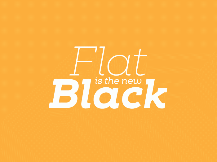
The flat design craze explained...

Tom Bradley
Related services
You've probably heard the term 'flat design' before - this is the latest design craze that has quickly swept up the creative world. Flat design can be defined by simple, uncluttered layouts, typically combined with solid colours and creative icons. With this new direction the emphasis is on visual clarity and encouraging usability whilst communicating messages in the simplest way possible. In the following article we explore what makes flat design such a winner.
Moving away from Skeuomorphism
'Pardon?' I hear you ask. Skeuomorphism is the designer buzz-word currently making the rounds. In essence we're referring to effects that are applied to a graphic to make it appear more 'real', so buttons become 3D with shiny bevelled edges and shadows and wonderful leather or wood effects to act as visual cues for the user. In comparison 'flat' loses these fake textures for a more honest, some might say 'digital', approach.
There are many reasons why the current design trend is moving away from these realistic effects but we feel there are 2 main factors which are driving the change more than others. The first is a generational change. Today's web users are predominantly either from a generation that have grown up with computers in their pockets or part of the generation that has seen modern computers flourish into the technological wonders that they are today. Both of these generations are more than accustomed to the act of navigating a website and no longer need such realism.
The second force driving design in a new direction is the advancement of technology. Websites, which previously had to perform on a small range of different sized monitors, now have to respond to a vast variety of different screen sizes and resolutions - from large desktop PCs and iPads to the latest Android handsets. In order to respond to these various sizes each element of your website must twist and turn to reformat to the most effective shape and position and, whilst the design world is getting settled in to this changing environment, designs have become simpler to make this scalable process easier. Which leads us to wonder - is this just the start?
Simple's not so simple
In the dawn of the flat design era less is most definitely more… but there's more going on behind these minimal designs than first meets the eye. Creating a simple site that looks good and communicates the same information as before can be a real challenge. After all, the design trend may be leaning towards a more basic look but businesses are still just as complex as they used to be and with very few visual elements available each message must be carefully thought out.
There are a few key things that identify a flat design for both screen and print and we've broken them down below:
White space
White space does not technically mean 'white' space, instead it refers to areas of free space which, in flat designs, is much greater than usual. Flat websites for instance, tend to have tall, scrolling pages due to the amount of white space around each icon and text area - this gives more emphasis on the content and thus making it easier for the user to digest.
Colour
Flat designs use colour like no other. Bold, bright and above all 'solid' colours are often used to cover vast areas of space. These shades can really grab your attention if used well.
Typography
With designs becoming clearer and with fewer elements than ever before, your website's typography has now been brought into focus. Good typography can make or break a minimalist website and can drastically effect the appeal of a message. Flat designs typically use one or two sharp, crisp font families used at larger sizes than normal (taking advantage of the open space available).
Icons & Illustrations
With the reduction of the amount of space devoted to text, designers are communicating messages more clearly using fun icons and clever illustrations - both of which are generally computer generated, crisp and minimalist in their own right.
Embracing change
At Root Studio we've found a 'flatter' approach to be appropriate for some of our clients' websites already and each has a strong emphasis on usability. The most recent example being The Little Espresso's new online ordering service.
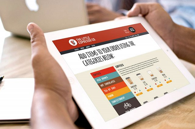
The Little Espresso Co. is arguably the smallest coffee bar in the UK (we've not checked but it's pretty small) and has long since been the studio's morning provider of the perky bean. They approached us to design and launch their new website, a system that would allow users to browse, order and pay for food and drink on static and mobile devices.
Not a lot of online shops have ever really done mobile shopping that well and often opt for a devoted app rather than a responsive website, whereas we think we've got it right with The Little Espresso Co. With over 50 products available, each represented with its own stylish illustration it was a challenge to make the process quick and easy but our design makes ordering your lunch and coffee a dream whether you're at your desk or playing frisbee in the park. Together with it's solid, bright colours, creative typography and fun illustrations - this flat design is one of our favourites.
Get in touch to discuss whether this new design trend might work for you.
Thanks for reading
For more news follow us @rootstudiouk
Similar posts
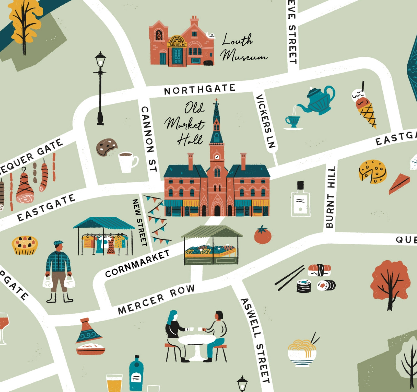
Illustrated maps can capture the essence and personality of a place, embodying its character and charm in a visually captivating way. In this article, we'll delve into the many considerations that you and your designer should make whilst crafting your illustrated visitor map.
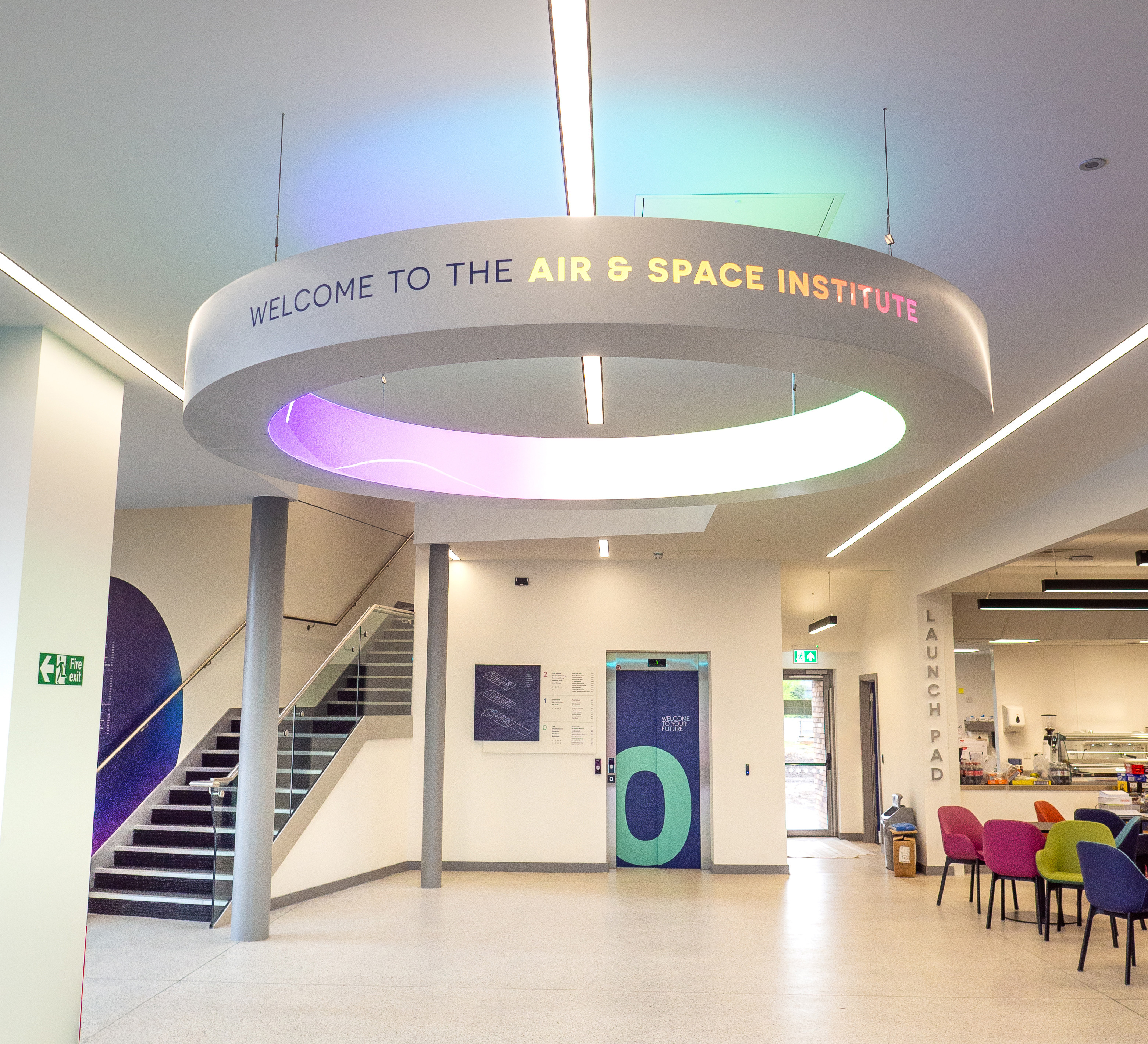
In recent months we've been working with the Lincoln College team behind the scenes at the development of their groundbreaking ASI campus in Newark to develop a cohesive and innovative collection of signage and wayfinding graphics for students, visitors and staff of the site.