Article
Apr '15
Does Google think you're mobile friendly?

Tom Bradley
Related services
As some of you will already know, Google have announced that as of April 21st 2015 they will be updating their search algorithm to expand their “use of mobile-friendliness as a ranking signal”.
This has implications for all website owners and administrators if ranking highly in the worlds largest search engine is important (which we’re going to assume it is!). If you’re a Root Studio customer with a website that Google might deem less-than mobile friendly you should already know all about this from our recent, gentle, reminder.
Google have been tagging mobile friendly website’s as ‘mobile friendly’ for a while now (when searched from a mobile device). This was a kind of ‘dry-run’ for their forthcoming algorithm changes later this month. If your website is already coming up with this tag, chances are you are ahead of the game and you will not suffer from the new system. If Google doesn’t see your site as mobile friendly however, when pitted against one of your mobile-friendly competitors, your site will soon start to slip down the ranking. You can find out if your website ‘passes’ the mobile friendly test by using Google’s own insights tool.
So what’s the big deal? “Hardly anyone visits my website from their mobile - no-one wants to check out my site when they’re on the go” you might say - you may well be right but research and analytics tells us that actually, you may well be wrong; mobile users may not be, well... mobile! Common use-cases for smartphones involve sitting in front of the television or eating your breakfast and surfing the web. These people may be looking at your website and not getting a great experience. You may be noticing a high bounce rate for mobile visitors or you may have already noticed that iOS and Android use of your site is falling, not increasing, and this could be simply based on the fact that Google is already labelling your site as having a poor user experience.
What Google is trying to do is make sure they are serving the best content to the widest proportion of their users - this is all they ever try to do. No doubt you’ll receive emails all the time from companies claiming to ‘move you higher in Google search results’ using their tricks of the trade. Google are looking for good content (we’ve blogged about improving your rankings through content before), they want their users to be happy that the search result took them to a relevant site and Google have decided a relevant search result, for a mobile customer, will deliver an optimised experience for the user.
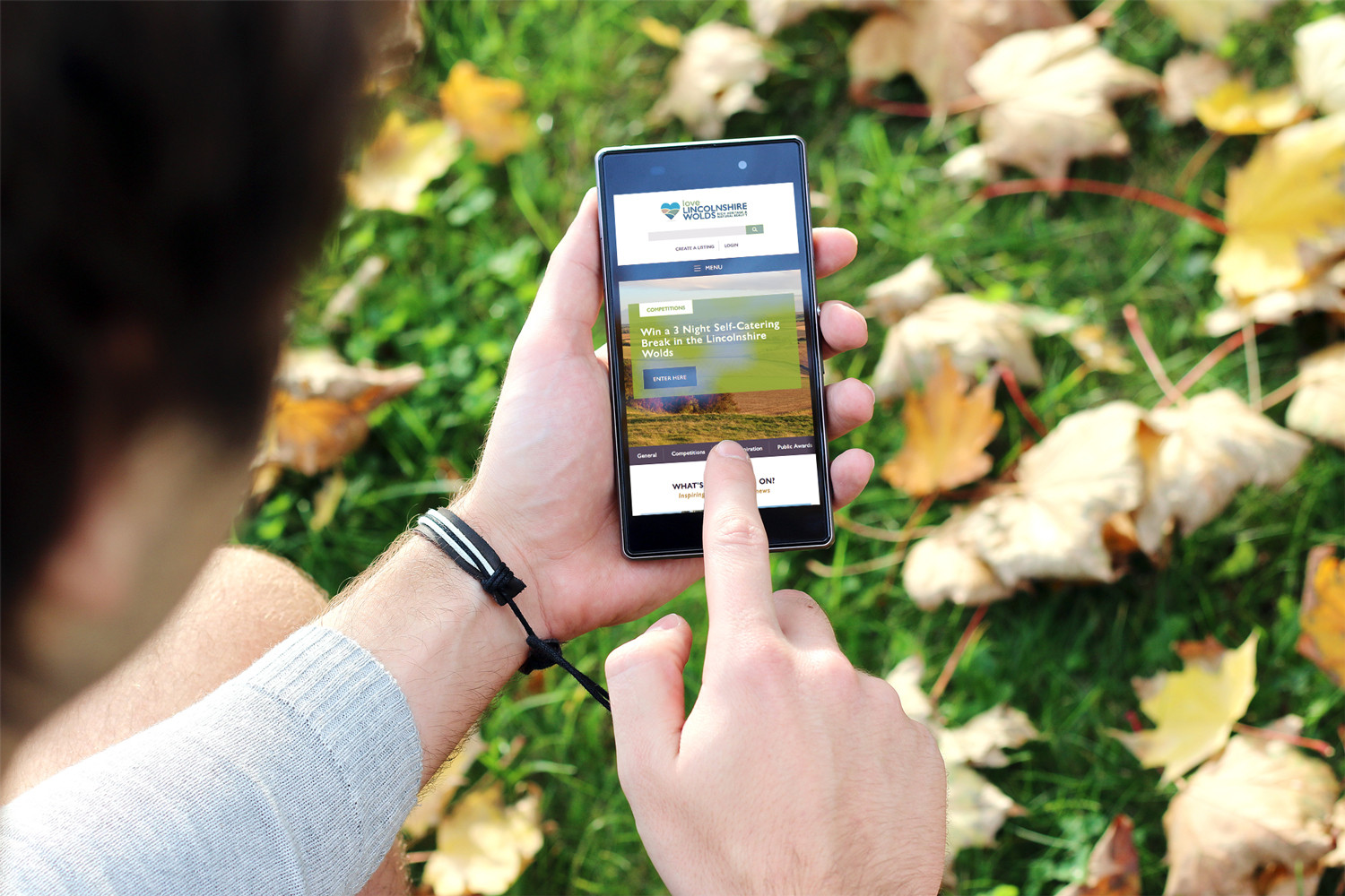
In essence Google wants your website to be responsive. We’ve been building new websites responsively as standard in the studio from late 2012 and it’s this approach that Google want to see. A responsive website is based on a flexible layout, with flexible images and media that builds in media queries to tackle problems as they crop up when ever smaller (or larger) devices use the website. Taking our website as an example, what Google want to see is a website that ‘reacts’ to your screen-size in real-time - if you grab your browser window and shrink it now, you should see how this page reacts to that change in size.
What does this mean for your website? If your website doesn’t react in this way and scores low in Google’s own test it may be time to address this issue. We think that Google’s forthcoming algorithm change is only the start - we can see other changes going forward, with mention of a speed indicator for slow websites on the horizon too - it’s clear that Google are going to promote websites that not only have great content but also websites that deliver that AAA experience for visitors. The days of tricking your way to a high ranking on Google are over (they have been for some time) and there's no time like the present to tackle the issue head on.
Making a plan
All this sounds very daunting but there are many paths forward. If the budget is there we’d always recommend a responsive redesign and rebuild and we’re currently undertaking such projects for a range of customers now to get them ready for the algorithm change. However, depending on the base you’re working with - if the foundations of your site are strong - then it may be possible to make changes to your existing site to improve the user experience for as many visitors as possible.
A good web agency should always be able to take a look at what you have now and recommend the best and most cost effective way forward. If your site is currently falling short then we’d love to hear from you and help you form that plan - based around yours (and your customers) needs.
Thanks for reading
For more news follow us @rootstudiouk
Similar posts
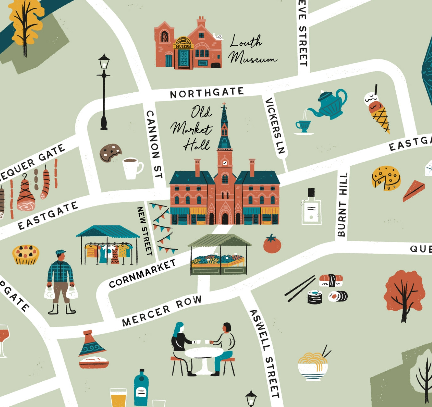
Illustrated maps can capture the essence and personality of a place, embodying its character and charm in a visually captivating way. In this article, we'll delve into the many considerations that you and your designer should make whilst crafting your illustrated visitor map.
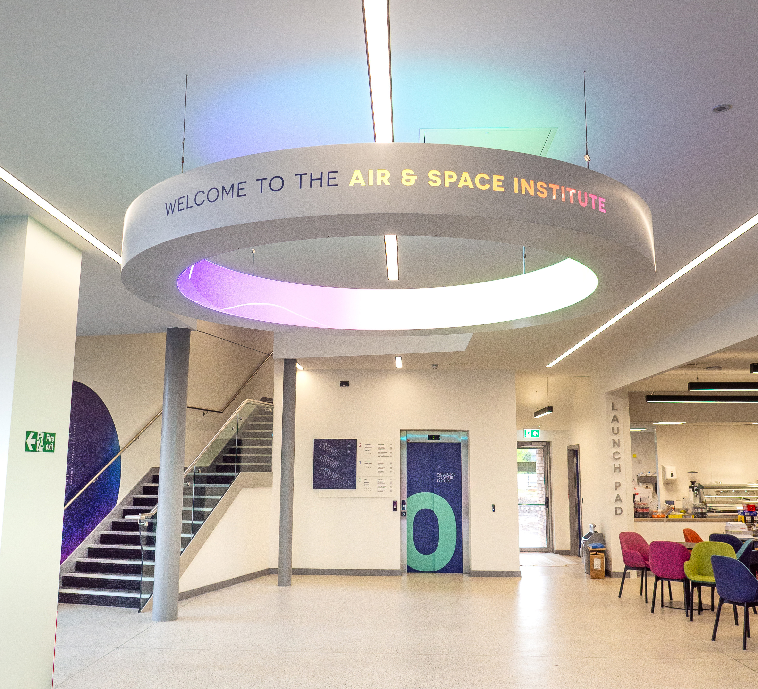
In recent months we've been working with the Lincoln College team behind the scenes at the development of their groundbreaking ASI campus in Newark to develop a cohesive and innovative collection of signage and wayfinding graphics for students, visitors and staff of the site.