Article
Jul '13
Mobile users aren't as mobile as you think

Tom Bradley

Related services
Do you need a mobile optimised version of your website? It's a simple enough request and it's a question we even ask in our website briefing pack, but is it the right question?
It can divide clients and customers and we see a lot of hesitation and confusion; "do I really need that?" / "my customers aren't really bothered about that" etc. However, posed another way, the question becomes a bit easier to answer. If we ask “do you want your website to work really well on a range of devices” then the answer is normally a resounding, “well of course I do”. In 2013 we believe there should no longer be a distinction between a ’mobile optimised’ version and a ’desktop’ version and with the techniques and tools available now we can absolutely produce great experiences, on all devices, with one website. At Root Studio we're constantly researching and improving our techniques and practises in an attempt to break down the distinction between mobile and desktop ’versions’ of websites for our clients.
There are many preconceived (and we would suggest incorrect) ideas about what a typical 'mobile' user might be looking for from your website. You might think it would be a great idea to cut down on content, that mobile users are on the go - they need to consume your websites’ information in an instant - and so the temptation is to start cutting out things that ’mobile users’ don't need on the ’mobile version’. This might lead to the striking banner graphic in the header of your site being completely removed from your mobile site and the condensing of copy and content to catch the attention of a mobile user, typically in a rush. However you'd only be considering one small target user...
What about your potential customer who's found your website from a quick Google search whilst watching TV, the contact you met at a networking event last week who’s just checking out your website from his phone or just someone who happens over your website from a tweet or a Facebook post? These people might have 10 seconds to digest your website or they might have 10 minutes - one thing that will make sure they ignore you is if they are presented with a tiny, zoomed out version of your website that they have to start pinching, zooming and scrolling or worse still, a watered down version of the desktop site ’optimised’ for people in a hurry, with a link back to the tiny, zoomed out version of your site - labelled the 'desktop version'.
These experiences are clunky at best but ultimately misleading and if your site doesn't provide a tailored experience on as many devices as possible then customers accessing your website from a mobile device will come away with completely the wrong impression of your site and your business.
There is another way - thinking with a 'mobile-first' attitude can bring excellent results, whether your website is viewed on the latest Android phone, iPad or Xbox IE on a 40" TV. We try to approach all new website builds from a mobile/content-first philosophy. When we come to wireframe a new website, if you start to think about what's important to mobile users, you start to realise that what you're really thinking about is what content is important for all your website users. If a section of content isn't necessary and is 'taking up too much space' on a mobile, why would desktop users want to view this content either?
A good example is the often requested detail of making contact details clear and easily accessible on the mobile site. Why, though, is this not an important consideration at every screen width? If your users want certain content whilst viewing your site using there Windows laptop, chances are they'll want to be able to access the same content on their iPhone or iPad - 'Mobile is not the "Lite" Version'.
Having a great website on any device, at any screen width is important for every business and building a great experience on mobile certainly doesn't mean dumbing down the experience to the lowest common denominator. Can your business really afford to ignore such a large chunk of potential website visitors? We love websites that work on any device - if you do too then give us a call.
Thanks for reading
For more news follow us @rootstudiouk
Similar posts
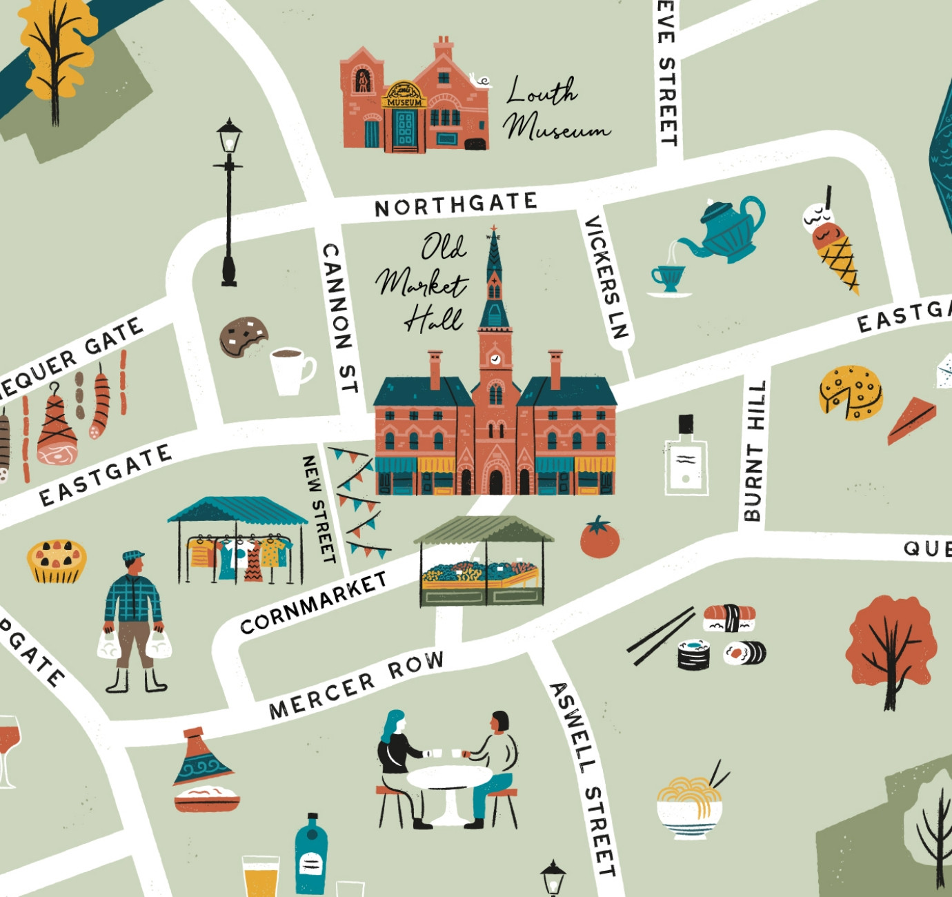
Illustrated maps can capture the essence and personality of a place, embodying its character and charm in a visually captivating way. In this article, we'll delve into the many considerations that you and your designer should make whilst crafting your illustrated visitor map.
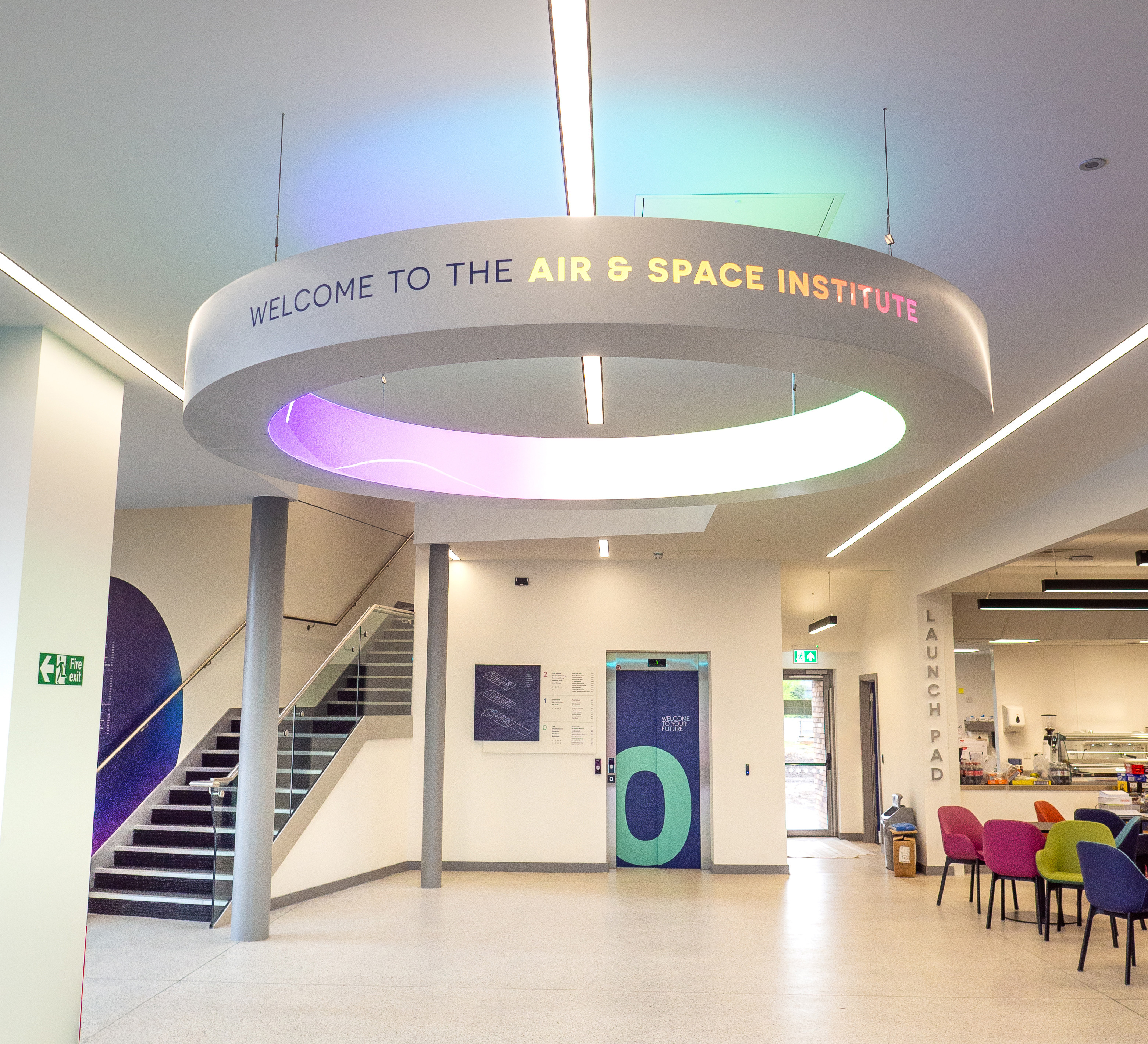
In recent months we've been working with the Lincoln College team behind the scenes at the development of their groundbreaking ASI campus in Newark to develop a cohesive and innovative collection of signage and wayfinding graphics for students, visitors and staff of the site.