Article
Jul '19
Tailoring a website for an elderly audience

Tom Bradley
Related services
At Root Studio we try to make websites that are accessible for all - not just those with the latest browsers, devices and connection speeds. This includes careful attention to detail with UI elements, content structure and responsive grids as standard. But what if you’re building a website that expects a more elderly average audience than a typical website? How can we make the design and functionality more user friendly as motor and visual impairments become a larger factor than you’d normally expect?
There are some general rules of thumb for web design as a whole which boil down to a nice memorable phrase: 'keep it simple stupid'. Make your design intuitive, giving users easy access to what they're looking to find. The issue here is that we can't assume that what one user finds intuitive will apply to others as well - for example there are a few familiar UI assumptions that won't necessarily resonate with a more elderly user.
Website navigation for the older generation
Let's start with hamburger menus - chances are you're pretty familiar with the term, this tool allows a designer to collect all of the navigation links together into one collapsible format typically represented by three small lines stacked on top of one another (creating a classic burger shape).
There have been studies over the years that suggest that these aren't as user friendly as you might think and that adding the word 'menu' alongside the hamburger button will help with usability, this is true but still adds an extra click to access a new page and relies on a degree of computer literacy to use. A far simpler and more intuitive design would be to include all of the navigation links together in a single row or column. This rule applies to tablet users too as we've seen a rise in recent years of elderly surfers opting to use larger touchscreen devices rather than desktop computers or fiddly mobile phones*.
Whilst we're on the subject of navigation, users with dementia may also struggle to remember which pages they have previously visited or how they can get back to where they started - there are a few tools which could help here too. Add a 'home' link rather than relying on the understanding that clicking the logo will take you back there is a simple one to start with. Secondly have you ever noticed how when you're browsing search results on Google some of the pages you've visited previously have changed colour? This is a great visual tool to allow a user to remember which pages they've already been to in that particular session.
Finally, leaving a trail of breadcrumbs (a simple breakdown of the route they've taken to get to a page) will allow a user to easily find their way back to multiple stages in their journey through the website (this tool is most commonly used on large e-commerce sites to allow users to work their way back through categories etc.).
Website aesthetics
When you consider that visual impairment might be a common factor in your website's audience then it's important to remember a few things:
Colour & layout
As we age, the ability to tell the difference between shades of the same colour declines and this is particularly true with shades of blue which start to become more and more desaturated as the condition worsens. With this in mind it's important that colour contrast plays a big factor in your design particularly when you want to draw attention to something. By using a bolder contrast and larger click/tap area for your call to actions should improve their click rate. Other visuoperceptual issues might include being able to see contrast between different shapes/layers within a design (a button over the top of an image for instance) and general field of vision might be more limited than a typical user so including the most important content within a narrower frame of vision would be a good decision to improve its legibility. Shortening the area for design will also reduce the distance between certain UI elements making them easier to reach for those with difficulties with motor control**.
Fonts
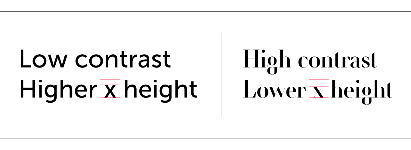
Making the fonts on the website bigger is a pretty obvious one when catering for visual impairments but what about font style? You could argue that a more traditional serif typeface has more distinctive shapes for each letter and should make it easier to read however the simplicity of sans serif shapes have been known to be more legible for larger bodies of content on a web page - particularly those with a low contrast design (a consistent weight to the line of each letter without going from thick to thin) and a taller x height (the height of lowercase letters compared to capitals). So a general rule of thumb would be to opt for sans serif typefaces for body copy and potentially serif typefaces for headings and subheadings (avoiding anything too script-like or overly fanciful).
Content
This is largely a rule for all websites but is particularly important with an audience such as this - content should be clear and jargon-free. Contrary to other users however, this audience has a longer attention span and more persistence on average than a younger user*** so are less likely to switch off when confronted with larger volumes of text so long as it's engaging and relevant. If however you are producing large volumes of copy, the ability for the user to print an article would be an added benefit allowing them to digest it over longer periods and in their own time.
The use of images and video to add context to your text content can also be a great idea - whilst this does arguably distract a user from reading it can also create a powerful visual cue to aid with the understanding of the message or tone. If you're using video however, make sure that you include subtitles and for images we need to ensure that each is equipped with an accurate description for those using screen-readers (not just a clutter of keywords for your SEO).
Shouldn't we be doing all of these things as standard?
If we say we build 'inclusive' websites that are accessible to all, shouldn’t we be doing all of these things as standard anyway? The answer is yes and no. Yes to ensuring that a site is easy to use with an intuitive design and accessibility tools in place wherever possible. But no to a watered down design that’s not tailored to the right audience. It’s vitally important to understand your audience as a design that tries to please everyone will invariably please no-one - with this approach you’ll design websites that are ‘ok’ for the masses but not ‘great’ experiences for your target audience.
We’ve enjoyed delving deeper into how we can make some of our websites super-accessible and hope that you find this blog post useful for your own business. If you’re considering creating or revamping a website soon - give us a call!
* The Guardian
** ACM
*** NN Group
Thanks for reading
For more news follow us @rootstudiouk
Similar posts
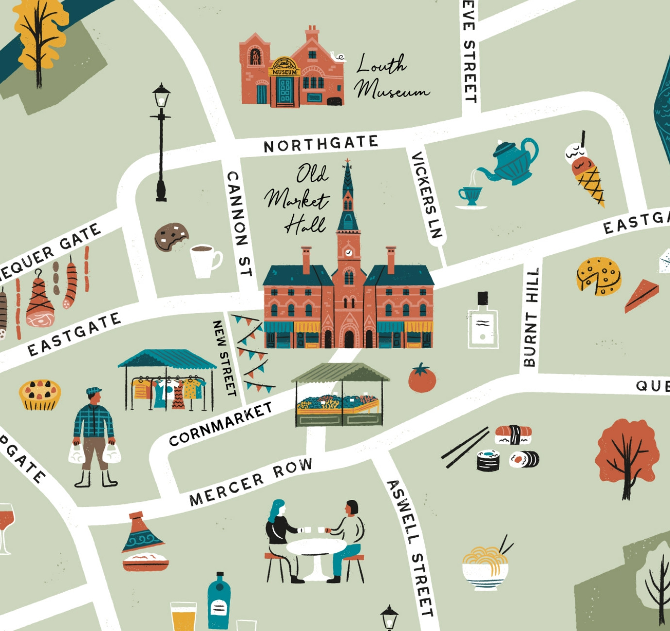
Illustrated maps can capture the essence and personality of a place, embodying its character and charm in a visually captivating way. In this article, we'll delve into the many considerations that you and your designer should make whilst crafting your illustrated visitor map.
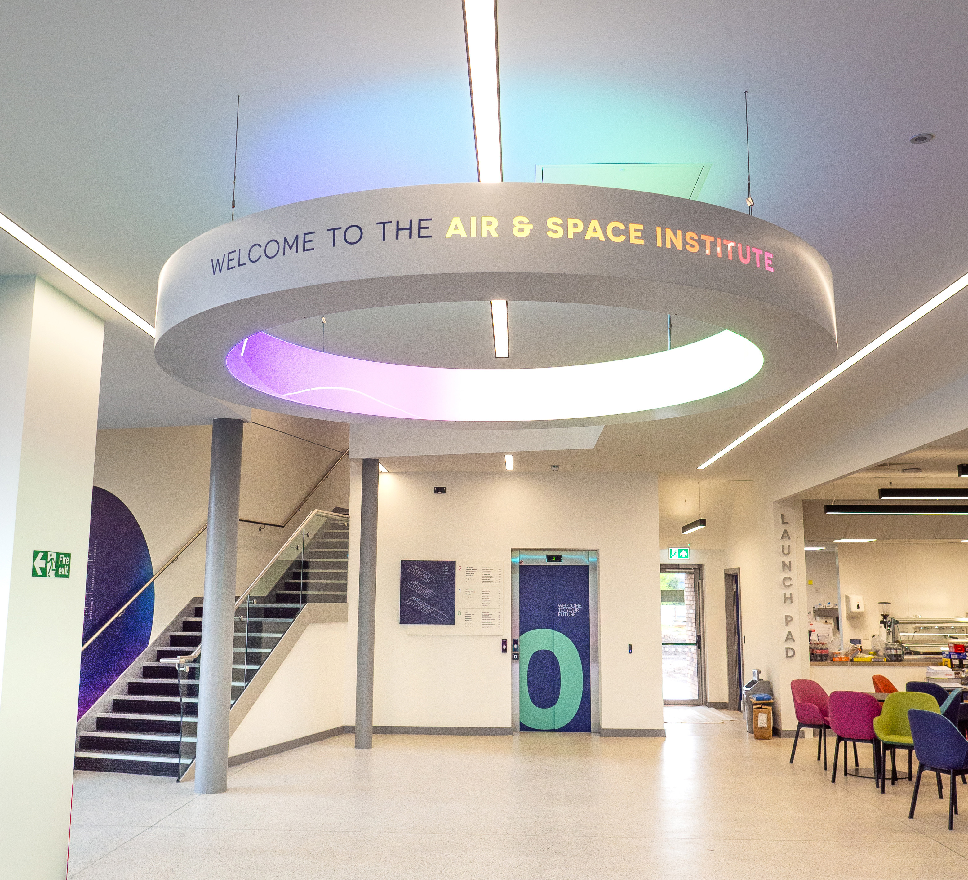
In recent months we've been working with the Lincoln College team behind the scenes at the development of their groundbreaking ASI campus in Newark to develop a cohesive and innovative collection of signage and wayfinding graphics for students, visitors and staff of the site.