Studio News
Aug '12
Our New Responsive Website

Tom Bradley
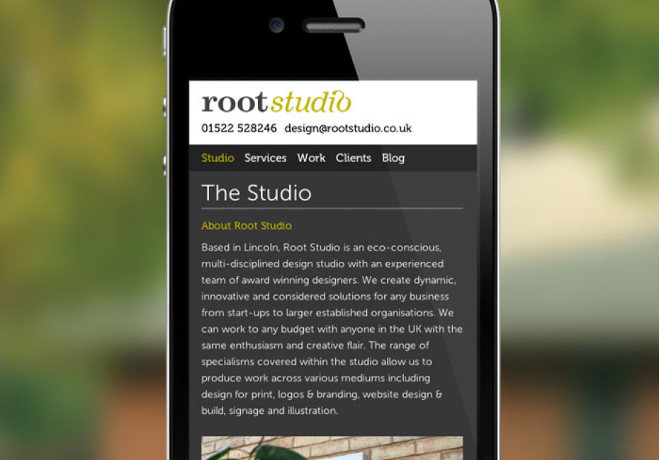
If you're reading this you're looking at our new, responsive, website. Try it out - we've tried our best to make the experience an immersive one on both mobiles and desktop devices alike. We're now going to try and explain a little bit about the exciting road we took to get here!
Design Stage:
The new website has been a labour of love for all of us in the studio. When we started the design we knew we wanted the site to be responsive and we knew it wanted to be coded using the latest HTML5. These were the only start points we had and at this point these technologies are still considered unchartered territory for the majority of design agencies out there.
We started the design process in the usual way in the studio, working initial sketches and drawings into Illustrator layouts and we tried to add a new stage to this process. Here we started to think about how the site would look on an iPhone and an iPad.
Fluid Template:
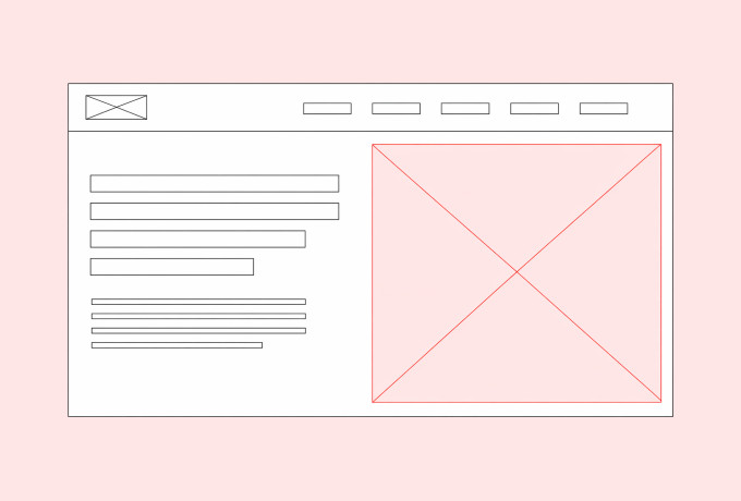
We're all used to seeing fixed width websites and it's how most of our sites have been built in the past and we're proud to say that this has been a good fit for all our clients with some very positive results “responsive builds are not fit for every purpose“ but our new site starts with something called a fluid grid. This means that instead of saying 'the website will be 960 pixels wide' we had to start thinking more in terms of the website being any width - we had to start thinking in percentages.
At any width - what percentage of the screen should this element take up? How wide should columns be? We had to think about line length and text size. These all became more important when thinking in a fluid way - we cannot control what width your browser window might be - we can't make sure that our paragraphs appear nice and neat and that we have an acceptable word count for each. This is an unnerving thing for a designer to come to terms with - we're perfectionists at heart!
In reality we hadn't lost control we just had to learn to set some parameters which made sure the website appeared in an acceptable way no matter what device you were using.
Break-Points & Media Queries:
With the best will in the world a fluid grid can't do it all. This is where our 'media-queries' come in. First off - to gain some control over how the site appears on larger monitors we put in a limit of 1200 pixels. This means that if your browser window is wider than this the website will stop filling up the screen and instead it will sit nicely in the centre of the web-page. We've added this to avoid images and lines of text stretching across a large screen (making it very difficult to follow).
Going in the other direction we added in specific CSS to change the grid to one column with a slightly increased text size on iPads and iPhones to make it a bit easier to read.
When we went down below 700 pixels we decided this is where our break-point for mobile would be. Any device with a viewport width below 700px is served our mobile version of the site. This is very important as if we were designing specifically for the iPhone then this point would be smaller but instead of using devices to decide our break-points we used the visual cues, the line length of text and the legibility of our navigation. We feel this is the best way to design the best user-experience for the site - make the website 'respond' when it needs to.
The biggest difference you'll see, other than column number and size changes at different widths is the site navigation. On mobiles we've streamlined this and ran it across the top of the site with easy to use contact links in the footer. We moved things around in this way to give the screen more width for our content underneath.
In Brief (ha!)
We've rambled on quite a bit here and I've only touched the surface of the obstacles we've overcome since we embarked on our fluid/responsive rebuild. We've improved the process and our own website has served as a great tool to teach us how better to tackle the process for future client sites. For example since we started this website we've designed and built other responsive websites (see Total Body Therapy ). What you see today is just the start and we will be upgrading things over the coming months, improving performance, adding features and regularly updating our latest work (take a look ). We hope you like, and maybe we'll do a proper, in-depth, geeky post about everything in the site one day!
note: we couldn't have built the site without some help from some well know plugins and books. Ethan Marcottes book (and tweets) about Responsive Web Design have been invaluable as have various javascript plugins and we'll be writing about those soon.
Thanks for reading
For more news follow us @rootstudiouk
Similar posts
Your hero image makes an impression before a single word is read. Here's the science behind why it matters and how to get it right.

Ever walked into a shop and immediately had a sales assistant on your shoulder? That tension you feel - that instinct to say "Er, just browsing thanks!" - is the hard sell doing its damage. There's a quieter, smarter way to bring clients to your door.