Project News
Jun '15
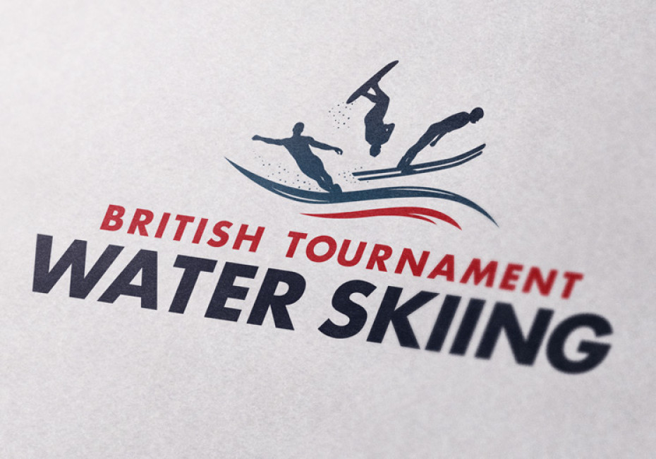
New logo design for British Tournament Water Skiing

Tom Bradley
Related services
After taking a brief from the team it was clear that the new branding must shout ‘quality’. The body was established in the sixties with a strong winning heritage and a reputation for working with the best skiers within a safe and professional environment.
After discussing various concepts we developed the finished logo using a combination of the three disciplines that the organisation focus on - water skiing, ski jumping and trick skiing. The new logo identifies the brand as undeniably British with its use of the Union Jack colour palette and clean, professional design. We thoroughly enjoyed working on the project and look forward to working with the team again soon.
Thanks for reading
For more news follow us @rootstudiouk
Similar posts

Your hero image makes an impression before a single word is read. Here's the science behind why it matters and how to get it right.

Ever walked into a shop and immediately had a sales assistant on your shoulder? That tension you feel - that instinct to say "Er, just browsing thanks!" - is the hard sell doing its damage. There's a quieter, smarter way to bring clients to your door.