Project News
Nov '19
Vehicle wrap design for Lincolnshire's state of the art fire engines

Tom Bradley
Related services
Designing artwork for vehicles presents a range of creative challenges but nothing matches the scale of this project!
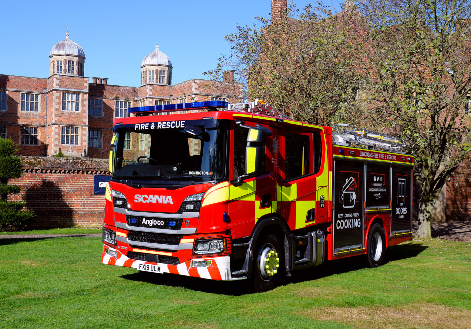
Every day is different with this sort of job and never was this phrase quite as relevant as when we were approached by the team at Lincolnshire Fire & Rescue to design the vehicle graphics for their brand new, state of the art fleet of fire engines. (The kid inside was seriously leaping for joy at this point).
The brief was to produce a range of concepts that pushed the boundaries of what had been done before with a view to harnessing the essence of these designs in a format that would be suitable for all ages, reading levels and languages whilst delivering a series of safety messages.

First things first, we set the fundamentals in place. There are certain rules when it comes to the design of a vehicle such as this and visibility at night is particularly key - with this in mind every concept must clearly outline the shape and scale of the vehicle from all sides. Next there were brand marks that needed to feature on the vehicle (whilst maintaining the proper hierarchy) and contact information of course. Finally, vehicles such as this are an incredibly useful tool for marketing a variety of safety messages to a wide audience - think of it as a travelling billboard with flashing lights. In addition to this we wanted to consider the tone of the messages, often these sorts of things are shouted on the side of vehicles in heavy, punchy typefaces and the terminology can be very direct and forceful - we wanted to tone this down a notch whilst ensuring that the messages were still clear and direct.
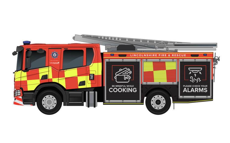
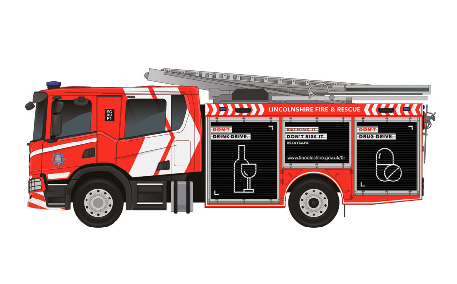
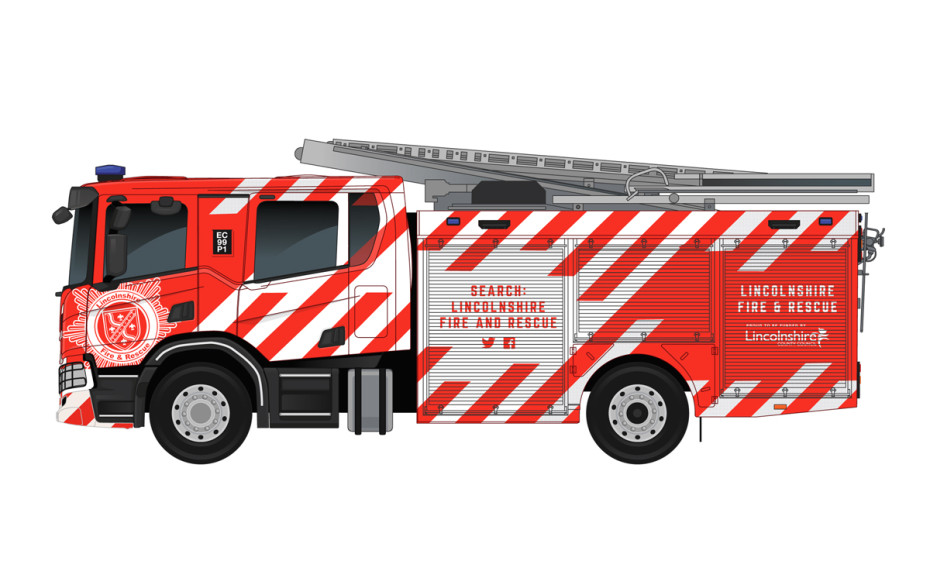
So, we set up a series of templates for the vehicle that would enable us to work on designs for all orientations accurately in both a daytime and nighttime theme (keeping a close eye on the high vis elements of the design). Here are examples of our initial designs.
Each concept had it's own approach in terms of highlighting the core messaging and tackling the preconceptions of what a fire engine should look like. Some designs were intentionally loud with a focus on making the engines so eye catching and different that they would inevitably be shared on social media and the messages spread virally.
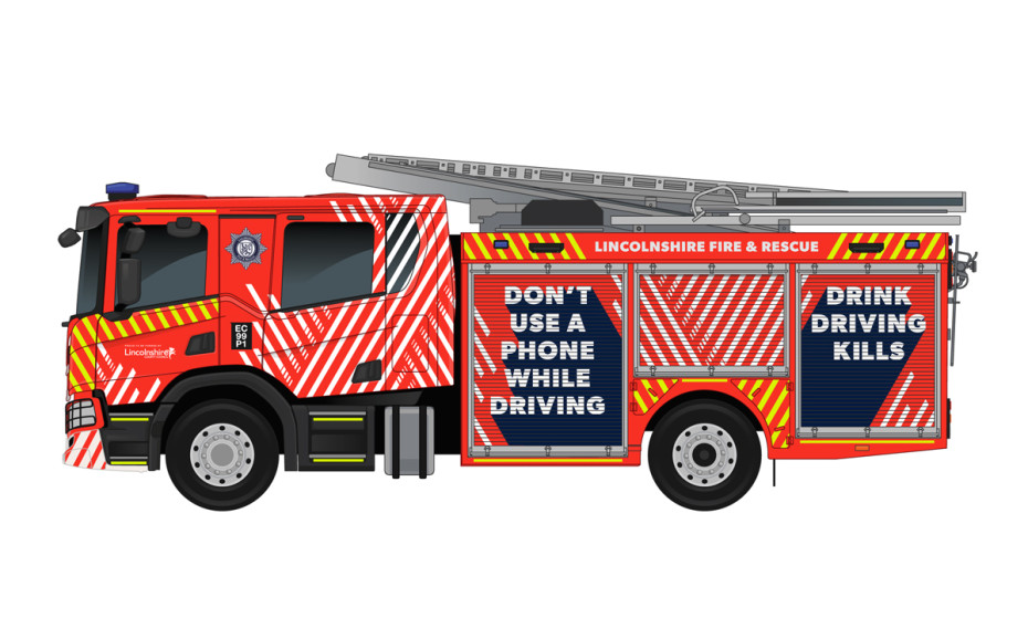
After much discussion a concept was developed and refined into what you can see saving lives across Lincolnshire today. The messaging that you see on the final design uses bespoke iconography so that people of all ages and nationalities can grasp the concepts without the need for wording. The text itself is more modern and softer than usual with emphasis on key words - again to ensure that the message is still clear when the engine is passing by at speed.


You can see from the image below that even at night, the outline of the vehicle is still clear, keeping motorists safe when the engine is used as a roadblock to safeguard firefighters on the scene.


In conclusion, this was a truly memorable project and one that every team member in the studio got involved with. We look forward to working with the Lincolnshire Fire & Rescue team on another exciting project soon! Whatever next?

Thanks for reading
For more news follow us @rootstudiouk
Similar posts
Your hero image makes an impression before a single word is read. Here's the science behind why it matters and how to get it right.

Ever walked into a shop and immediately had a sales assistant on your shoulder? That tension you feel - that instinct to say "Er, just browsing thanks!" - is the hard sell doing its damage. There's a quieter, smarter way to bring clients to your door.