Project News
Apr '20
Our creative van wrap designs for Lincolnshire Fire & Rescue

Tom Bradley
Related services
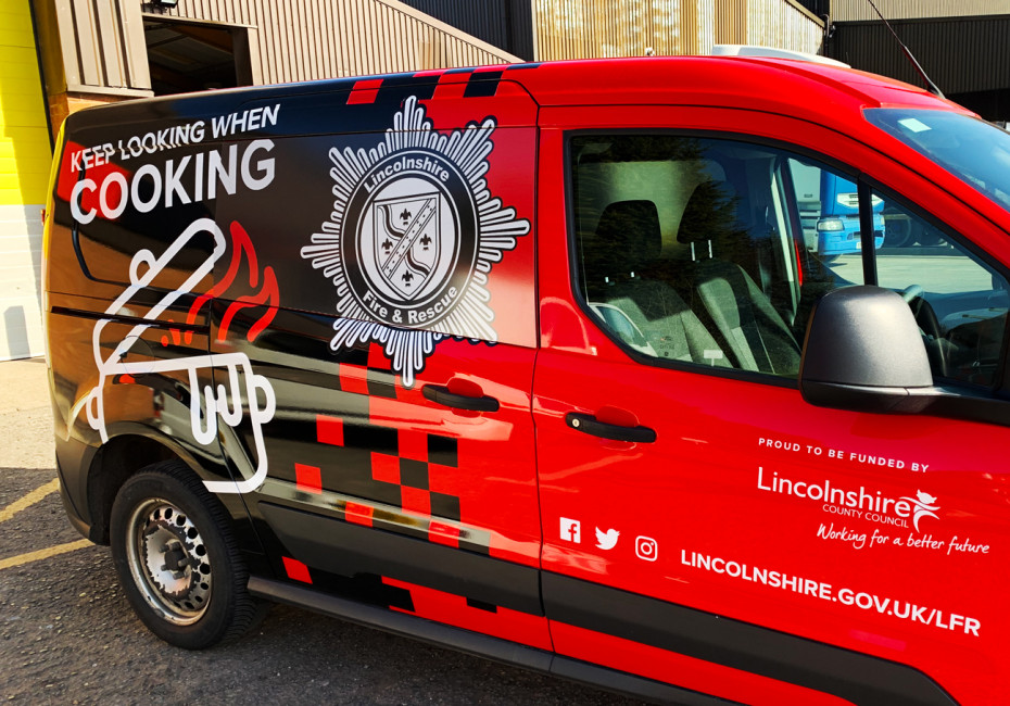
Following the success of our recent wraps for both Lincolnshire and Nottinghamshire's fleet of fire engines, we've moved our attention to a fleet of vans travelling the county.
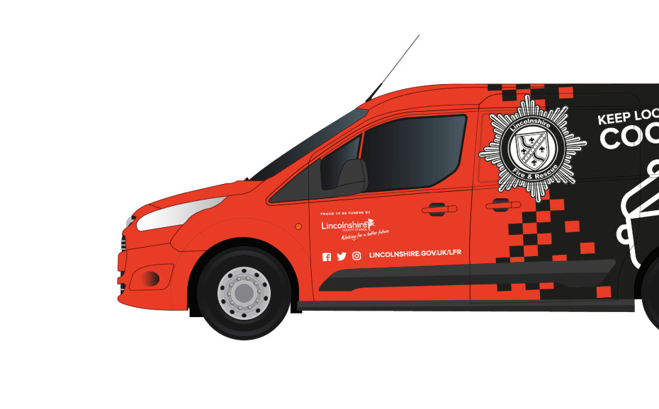
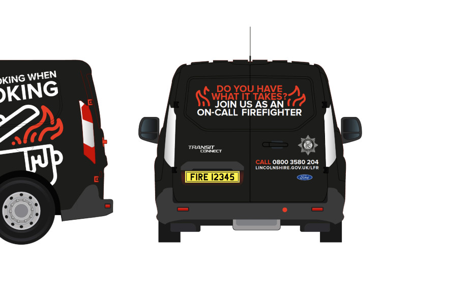
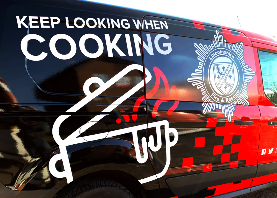
We wanted to ensure that the branding that we had introduced for the new fire engines was carried through onto this group of 10 vans used by the Lincolnshire Fire & Rescue team to create a consistent look across the board. To achieve this parallel we've included the set of iconic graphics that we created for the larger vehicles and blown them up to take centre stage alongside the redrawn fire service logo. The scale and styling of these graphics ensures that the important safety messages they represent are eye catching and engaging for the general public.
Using a fantastic material called Contravision, the fire service badge that covers the side windows is actually 'one-way'. By this we mean that the design is almost entirely invisible to the eye when viewed from inside the van.
The design is also cost effective in that is is not actually a full wrap - instead we've utilised the original red shade of the vans and incorporated this into the design with the battenburg inspired fade.
If you have any signage or vehicle wrap requirements please get in touch and we'd be delighted to discuss the project with you.
Thanks for reading
For more news follow us @rootstudiouk
Similar posts
Your hero image makes an impression before a single word is read. Here's the science behind why it matters and how to get it right.

Ever walked into a shop and immediately had a sales assistant on your shoulder? That tension you feel - that instinct to say "Er, just browsing thanks!" - is the hard sell doing its damage. There's a quieter, smarter way to bring clients to your door.