Article
Sep '19
Why using letterpress has made me a better designer

Tom Bradley
Related services
Over the last few months we've been experimenting with using antique letterpress printing blocks in our work and we've seen some fascinating results! Tom tells us more about his experience with this tactile medium...
A few years ago, I attended a letterpress workshop for beginners at Robert Smail’s Printing Works near Edinburgh and absolutely fell in love with the process. Since then we’ve been gathering wooden type at every available opportunity - antique shops, print fairs, eBay - even Instagram - and we have now built up a significant collection of our own to use for both commercial and personal projects.
For those who aren't familiar, letterpress printing as a technique was born over 500 years ago and until the 1950s was widely used for printing books, posters and more - eventually replaced by offset printing. The process involves setting individual letters (typically made of wood or metal) in a mirror image of what you intend to print - this can then be used to print ink onto sheets of paper or other materials.


Why not just use letterpress style fonts on the computer?
Over the years we’ve worked on a number of projects that need a rough, textured or aged look and would turn to fonts we have available on our computers that give a similar effect to the letterpress printing process. These fonts have been given a worn look to make them a little rough around the edges but the truth is they don’t compare against the real thing.

In recent projects we’ve been experimenting with setting headlines with our own hand crafted wooden type (most of which over 100 years old) and hand printing them using a Victorian cast iron book press that we picked up a number of years ago. The results of these hand-crafted prints never fail to deliver unrivalled texture, detail, splodges and marks that you would otherwise miss out on if you simply turned to a vector typeface mimicking the process.
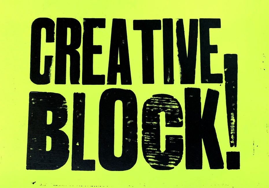
Below is an example of a recent project created using our own letterpress collection:


So how has it made me a better designer?
From studying graphic design over the years I like to think I had a good grasp of typography and layout but after my Scottish workshop I now have a much deeper understanding and a whole new perspective on my work.
When setting type for an A4 document for example you are bound by a solid frame in which you must fit all of your text. Choosing a font size and weight that will fit the space accurately and neatly is infinitely more difficult when setting by hand rather than on a computer. Combining typefaces adds a whole new level of difficulty and then there's printing in more than one colour or with a gradient - don’t even get me started on this!
Graphic designers have an innate desire for perfection and when faced with a physical jigsaw of bits, working upside down with limited typefaces and sizes to choose from, you’re faced with embracing the unusual and challenging your normal process or what you would normally find acceptable. Even once you have your artwork set in place - printing is a whole new messy challenge. Covered in ink from head to toe you’ll run copy after copy of your artwork off the press with minor adjustments each time - a perfectionist’s dream (not the dream of a neat-freak! apparently there’s a difference).
We’re going back a few years now but my University dissertation focused on ‘accidental design’ and how happy mistakes can often lead to a much richer, more unique piece of work. It’s true that getting your hands dirty and experimenting with your work will push the boundaries that the almost clinical environment of software can set in place.
We also recently attended an inspiring talk from renowned designer Tina Touli who is famous for her experimental typography - using physical prototypes to create unusual effects rather than jumping straight into Photoshop. If you haven’t seen her work before then it’s well worth a look.
Further to enhancing the process, I already knew and used standard industry terminology and had been taught the origins but, with actual hands on experience of setting type manually, I now have a physical, tangible connection to the words. For example:
‘Leading’ for graphic designers refers to the spacing between each line of text. The origin of this term stems from letterpress printing where an actual thin slice of lead is placed between each line. So for example a heading printed at 20pt with 23pt leading would have 3 points of lead packed between each line.
I don’t need to tell you what ’Uppercase’ and ‘Lowercase’ refer to, but did you know that these terms originate from letterpress printing too. Quite simply, fonts were stored in large sets of drawers or ‘cases’ - capital letters were stored in the top draws (upper cases) and small letters towards the bottom (lower cases).
Everyday phrases that come from letterpress printing
Interestingly the print industry was so vast and influential in years past that it’s actually permanently left its mark on us all in many of the phrases we use on a day to day basis. Here’s a few that you can impress your friends with down the pub:
“Out of sorts”
Nowadays this phrase refers to someone who’s not feeling well or they’re in a bit of a grump - back in the day this term was used when a typesetter ran out of the letters they needed from a particular font. A ‘sort’ is an individual character or letter from a font, each individually carved or cast to a certain size - when you’ve set an entire page of a newspaper and find that you’ve run out of the letter ‘e’ I can imagine I’d be grumpy too!
“Mind your P’s and Q’s”
In the UK this tends to mean that should be ‘on your best behaviour’ - in the US they’re closer to the true origin meaning ‘paying close attention’. When setting type the letters are all back to front and upside down which can make it rather difficult to differentiate between certain letters - p&q and b&d for instance. P and Q were particularly difficult as they’re alongside each other in the type case.
“Stereotype”
Setting large areas of text can be a time consuming process so, for instances where a body of text is used on a regular basis (a popular book for instance that’s likely to need reprinting at a later date) the whole page would be cast as a solid sheet of text. This solid sheet was called stereotype and the process of replicating the same thing over and over again gives us our modern understanding of the word. The French term ‘cliché’ stems from a similar place - instead of printing entire pages, the French would often produce stereotypes of regularly used phrases or words to save time. When striking the metal to create these sections the machine would make a loud ‘click’ sound - the French verb for ‘to click’ is ‘clicher’ - and so cliché was born.
“Typecast”
Metal type was cast in a mold and it’s believed that the phrase “typecasting” is a nod to this process or ‘fitting the mold’.
There are plenty more but that’s all we’ve got time for I’m afraid!
If you'd like to work with us on a creative letterpress design for your business get in touch :)
Thanks for reading
For more news follow us @rootstudiouk
Similar posts
Your hero image makes an impression before a single word is read. Here's the science behind why it matters and how to get it right.

Ever walked into a shop and immediately had a sales assistant on your shoulder? That tension you feel - that instinct to say "Er, just browsing thanks!" - is the hard sell doing its damage. There's a quieter, smarter way to bring clients to your door.