Project News
Mar '15
New logo designs for Lincoln property developers

Tom Bradley
Related services
Two luxury property developers in Lincoln have commissioned Root to develop new visual identities for their two new businesses, Rooms in Lincoln & Gardiner Homes, each to embody their new sleek, professional and trustworthy image.
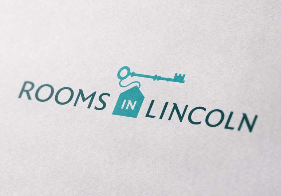
Rooms in Lincoln offer beautiful rooms in desirable locations aimed at local professionals. With this in mind it was clear that the logo needed to have a premium feel whilst maintaining the approachable and friendly nature of the family-run business.

We have created a distinctive logo mark of a room key & tag which forms the shape of a house, this symbolises the safe and secure locations that Rooms in Lincoln have on offer. The typeface uses a subtle serif detail that sets a sophisticated and timeless tone.

When designing the Gardiner Homes logo it was important to show how each project is approached individually, with quality and reliability every time.
The logo identifies themes of architecture by using a floor-plan icon that creates their initial, ‘G’; by mirroring the bold and thin lines from the typeface within the icon we have created a connected and considered design. The floor-plan branding has also been carried through across to their new stationery.

Thanks for reading
For more news follow us @rootstudiouk
Similar posts

Your hero image makes an impression before a single word is read. Here's the science behind why it matters and how to get it right.

Ever walked into a shop and immediately had a sales assistant on your shoulder? That tension you feel - that instinct to say "Er, just browsing thanks!" - is the hard sell doing its damage. There's a quieter, smarter way to bring clients to your door.