Signage
Mar '25
Signage That Works: The Principles of Great Wayfinding Design

Tom Bradley in Signage
Related services
Wayfinding signage is one of those things people only notice when it goes wrong. If it’s clear, intuitive and well-designed, visitors navigate a space effortlessly. But if it’s confusing or inconsistent, frustration sets in.
Whether you’re managing a commercial building, an educational institution or a tourist attraction for example, good wayfinding design enhances user experience, strengthens brand perception and ensures accessibility for all.
Done well, wayfinding signage does more than point people in the right direction - it shapes how they feel about a space and their overall experience within it.
How to design great wayfinding signage
A great wayfinding system blends strategy, creativity and clarity. To help direct you which way to turn (I know, I'm sorry), we've broken down some key components and priorities below:
Improving visitor experience and engagement with wayfinding signage
Wayfinding should make navigation effortless. When people can move seamlessly through a space, they feel more comfortable, confident and engaged.
Clear and considered signage can help to reduce stress, prevent bottlenecks and allows visitors to focus on their experience rather than figuring out where to go next.
This is particularly crucial in large or complex environments such as airports, hospitals, shopping centres and universities, where intuitive navigation can significantly enhance the visitor’s (or regular user's) overall experience.

How to identify potential wayfinding issues and resolve them by design
To ensure a seamless visitor experience, consider:
Observing visitor behaviour – Watch how people move through your space. Are there common areas where they hesitate or look confused?
Analysing traffic flow – Identify high-footfall areas and potential congestion points to optimise signage placement.
Considering typical visitor journeys – There will likely be various regular start and end points to your visitor journeys. Consider a number of scenarios and plan your route to identify potential areas where visitors may need direction or further instruction.
Gathering feedback – Ask visitors or staff where they (or other visitors) encounter difficulties and use this insight to refine your suite of signage.
Testing the wayfinding system – Conduct walkthroughs with new users to pinpoint unclear directions or missing information.
Addressing these factors allows for the creation of a wayfinding system that proactively eliminates confusion and enhances overall visitor satisfaction.
An improved brand experience
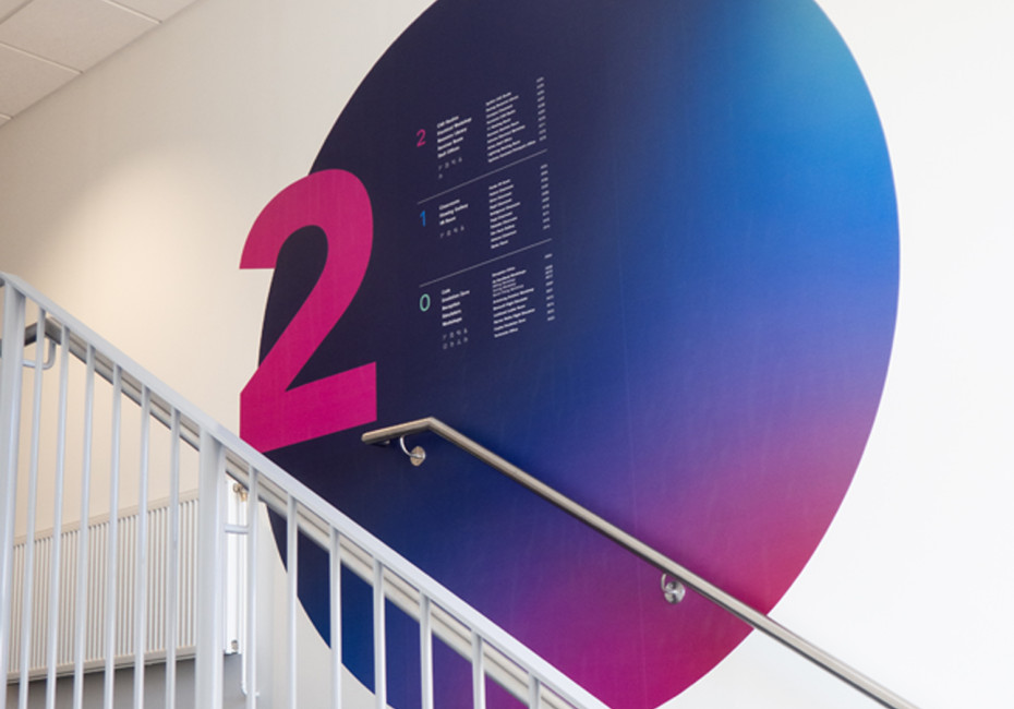
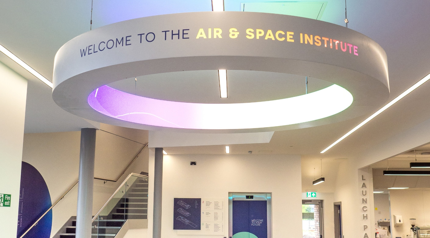
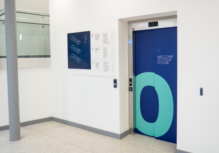
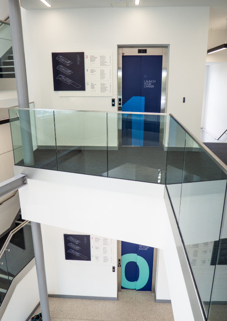
Every sign is an opportunity to reinforce your brand. Thoughtful design, consistent typography, colour schemes and material choices all contribute to a space’s identity.
Well-branded signage makes an environment feel polished, professional and uniquely yours, building trust and recognition among visitors. This extends beyond just logos - effective wayfinding integrates brand tone, style and messaging, ensuring a seamless experience that aligns with the organisation’s identity.

The importance of a style guide and visual language
A consistent visual language is key to maintaining a professional and cohesive wayfinding system. Developing a style guide for signage ensures:
Consistent typography, colour schemes and iconography.
Standardised placement and sizing of signs.
A unified tone of voice.
A seamless brand experience across all touchpoints.
By establishing clear design principles, organisations can avoid inconsistency and ensure that signage aligns with their broader branding and communication strategies.
Balancing creativity with usability
While creativity in signage design is important, functionality must always come first. Beautiful signs that are difficult to read or interpret defeat the point.
The best wayfinding designs strike a balance between aesthetic appeal and practical usability, ensuring information is easy to understand while enhancing the visual appeal of a space. Consider using engaging visuals, custom illustrations or creative typography while maintaining clarity across your designs.

Accessibility in wayfinding signage
Ensuring accessibility in wayfinding signage is not just a best practice - it is a responsibility.
Spaces should be designed to accommodate everyone, including individuals with visual, mobility or cognitive impairments. A well-thought-out wayfinding system enhances independence, providing clear and intuitive navigation for all users.
Accessibility goes far beyond just larger text sizes, it's about fostering inclusivity and ensuring that no visitor feels excluded or frustrated when trying to navigate a space.
Positioning, height and location – Signs should be placed where they are easily visible and readable for all users, including those in wheelchairs.
Clarity of the message – Information should be simple, direct, free from unnecessary jargon and written to a lower reading age.
Globally understood terminology & iconography – Using universally recognised symbols and straightforward wording ensures that signage is effective for a diverse audience, including non-native speakers.
High-contrast colour schemes – This improves readability, particularly in different lighting conditions.
Large, legible fonts – Avoid decorative typefaces that compromise clarity, particularly with important notices and smaller body copy.
Braille & audio elements – Useful for visually impaired users to navigate spaces independently.
Wheelchair-friendly placement – Avoid positioning signage too high or in obstructed areas.
Overall, accessibility isn’t just about compliance – it’s about creating a welcoming space for everyone.


Signage type & material selection
Choosing the right signage material is a crucial decision that impacts not only the look and feel of your space but also the longevity and sustainability of your wayfinding system.
The materials used must align with the environment in which they are placed, withstand wear and tear and complement the overall aesthetic of your branding.
Additionally, the choice of materials can influence maintenance costs, recyclability and environmental impact. Selecting durable, sustainable options helps create a long-lasting and responsible signage solution.
Plastic Signage
Versatile and lightweight, making it suitable for both temporary and permanent applications.
Can be made from recycled plastics, reducing environmental impact.
Weather-resistant options available for outdoor use.
Many plastics are recyclable at end of use, particularly acrylic and polycarbonate, if properly processed.
Metal Signage
Highly durable and long-lasting, ideal for high-traffic areas.
Weatherproof and corrosion-resistant, making it excellent for outdoor use.
Aluminium is one of the most sustainable signage materials, as it is widely recycled and requires minimal energy to repurpose.
Vinyl and Printed Graphics
Flexible and easy to update, great for temporary or seasonal signage.
Can be printed using eco-friendly inks to reduce environmental impact.
Some vinyl materials are now PVC-free and biodegradable.
Wood and Sustainable Materials
Eco-friendly and aesthetically pleasing, particularly for natural or heritage environments.
Can be sourced from responsibly managed forests (FSC-certified).
Biodegradable and recyclable, though may require more maintenance.
Digital Signage
Allows real-time updates, reducing the need for reprinting and waste.
Can be integrated with renewable energy sources, such as solar power.
Highly interactive, providing an engaging user experience while reducing material waste.
By selecting the right materials, businesses can ensure their signage is not only effective but also environmentally responsible, reducing waste and embracing sustainable production methods.
The importance of language and tone of voice in signage design
The words on your signs matter just as much as the design. Clear, concise messaging reduces confusion, while the right tone of voice sets the mood.
A friendly, welcoming tone works well in public spaces, while a more formal tone might suit corporate environments. The key is to align the language with your brand and audience while keeping directions simple and action-oriented.
Additionally, using action-oriented wording such as “Follow this path” or “Lift to all floors” rather than ambiguous phrasing helps eliminate uncertainty.
Consistency in phrasing, symbols and translations is also critical in multilingual environments, ensuring that every visitor receives the same clear message.
Do I need to use a professional signage designer?
Wayfinding design isn’t just about making signs look nice – it requires a deep understanding of user behaviour, spatial awareness and accessibility. A professional designer ensures:
Strategic placement for maximum effectiveness.
Clear, legible typography and high-impact colour choices.
A cohesive brand experience throughout the space.
Compliance with accessibility regulations.
Consideration of materials, lighting conditions and environmental factors.
DIY signage often results in inconsistencies, readability issues and missed opportunities to enhance user experience. Investing in expert design pays off in the long run by improving efficiency, reducing confusion and reinforcing a strong brand presence.
To conclude...
Great wayfinding signage is more than just a tool for navigation - it’s an essential element of a well-designed space. It enhances visitor experience, strengthens brand identity and ensures accessibility for all.
By prioritising clarity, consistency and sustainability, organisations can create wayfinding solutions that are both functional and visually appealing, whilst investing in professional design and thoughtful material selection ensures that signage remains effective, durable and aligned with the needs of its users.
Whether you are updating an existing system or designing a new one from scratch, great wayfinding is key to creating a seamless and welcoming environment.
If you have a project coming up and would like assistance, please get in touch - we'd love to hear from you.
Thanks for reading
For more news follow us @rootstudiouk
Similar posts
Your hero image makes an impression before a single word is read. Here's the science behind why it matters and how to get it right.

Ever walked into a shop and immediately had a sales assistant on your shoulder? That tension you feel - that instinct to say "Er, just browsing thanks!" - is the hard sell doing its damage. There's a quieter, smarter way to bring clients to your door.