Project News
Feb '15
Great branding in action at Grimsby's Cycle Mode

Tom Bradley
Related services
Having worked with Cycle Mode boss, Guy Kemp, on branding and marketing materials for one of his other businesses, we were approached to take the existing established brand on to the next level.

We began, as always with research. By looking into his target audience, trends associated with the brands on show in the store, trends in the marketplace and started to think where we should be placing Cycle Mode in amongst its competitors (whist also considering Guy's vision for the interior design of the new store which launched later that year).
With research complete and ideas discussed we began to look at fine tuning the existing brand. We tweaked the typography and strengthened the colour palette. Once we were happy that the core brand was up to scratch we suggested a secondary typeface to support the brand in terms of its more adventurous products, we also looked at how the brand could adapt to promote the many different activities that the bikes on sale could eventually be used for.

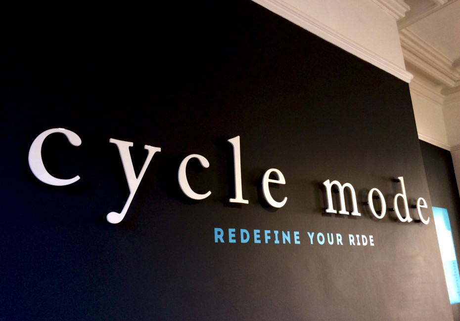
The new main strapline for Cycle Mode became 'Redefine your ride'. This core message was then to be re-enforced with various supporting messages for the other 'modes' of cycling, including: Track Mode : redefining the limits, Sport Mode : re-breaking the records, Build Mode : re-creating perfection and Style Mode : re-modeling yourself. The introduction of the bold arrows instantly provided the brand with movement, direction and energy.

At our recent visit to the store we were pleased to see how Guy and his team had put their brand guidelines document to good use and we look forward to seeing where we can take the brand in years to come. You can visit the Cycle Mode website here.
Thanks for reading
For more news follow us @rootstudiouk
Similar posts
Your hero image makes an impression before a single word is read. Here's the science behind why it matters and how to get it right.

Ever walked into a shop and immediately had a sales assistant on your shoulder? That tension you feel - that instinct to say "Er, just browsing thanks!" - is the hard sell doing its damage. There's a quieter, smarter way to bring clients to your door.