Project News
Dec '19
How we rebranded one of the region's largest accountancy firms

Tom Bradley
Related services
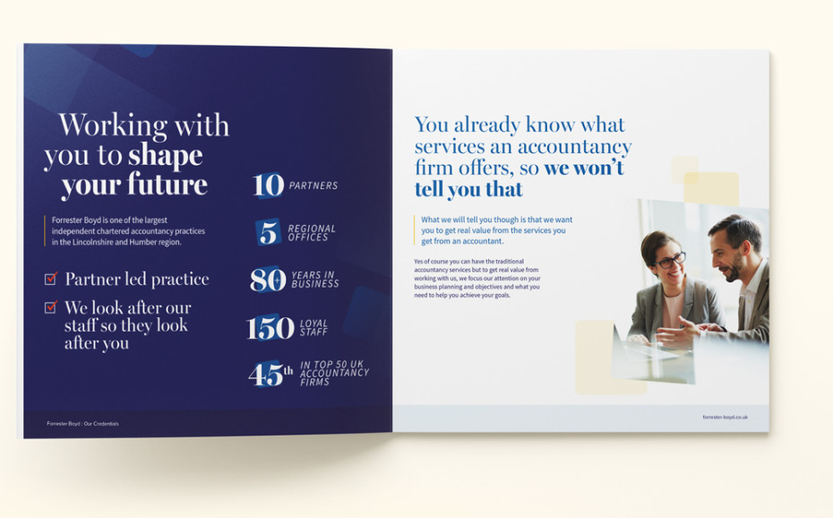
With over 80 years of history and 150 loyal staff, Forrester Boyd is one of the top accountancy firms in the region.
We were approached by the business to assist with refreshing their literature and branding following a review of their content and brand messaging. From our research we concluded that revisiting the logo itself, addressing the supporting graphics for the brand and also considering the content of their marketing collateral would be beneficial.
By working closely with the Forrester Boyd marketing department we looked to develop a refreshed style and approach to their marketing, something more befitting a practice of this scale.
"When I joined the firm 12 months ago, I wanted to ensure that any marketing promotional material reflected the firm, its heritage, and its extensive expertise which is delivered by the staff but more importantly, I wanted to ensure that we focussed our marketing on our clients and communicating the benefits that we can offer by working with our experts."
Alison Mitchell, Marketing Manager at Forrester Boyd
Reflecting the target audience
Forrester Boyd's updated branding and marketing needed to not only reflect their position as a market leader but also to carefully consider their target audience and respective values. Only by considering the customer and their journey in great detail would we fully understand how, where and when to promote their services in the best light. A safe assumption is that their largely B2B audience will typically be logic and practicality focused. Key decision makers will be focusing on how Forrester Boyd can save them time, money and resources so it was important that we highlighted the practical benefits on offer. Businesses would also be looking for an industry expert to help them with their finances so it was also important that we made this clear within their content moving forwards, with a strong focus on sector-specific expertise.
"With any service driven company there is always the danger that you can focus on trying to tell people everything that you do when in reality, people know what an accountancy firm does, what they want to know is what makes you different and what value can you add for them that another firm cannot. That is what we have focussed on. All of the work that we deliver is based on understanding our clients to be able to offer our expert advice and work in close partnership with them and I feel that our marketing collateral now reflects that approach perfectly."
Alison Mitchell, Marketing Manager at Forrester Boyd
Development of the logo
In the first instance we addressed the logo itself, looking to make any subtle improvements that could be made prior to working on the brand. With such an established brand we didn't want to suggest a complete overhaul of the logo, so we suggested a series of minor refinements that would avoid any jarring experiences for existing customers or the need to rush out and update all of their existing materials to reflect the updates.
The first image above details some of our suggested tweaks aimed at improving the legibility and hierarchy of the logotype whilst maintaining a consistent brand feel. The more refined layout in the second image creates a modernised feel to the brand.
The new rounded icon shape has now become a useful container for imagery and other content across the Forrester Boyd marketing materials.

Updating the colour palette
Next we focused on updating the brand colour palette. The existing palette consisted of three colours which left little room for flexibility across their marketing. Our solution was to revise the colour palette and include a number of complimentary darker and lighter shades to provide more options across their branded materials.
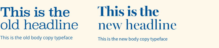
Focusing on typography
The combination of a serif heading and sans serif for the body copy can be effective in portraying the business as having traditional values and experience in the field whilst also having a more modern approach. By coupling a more elegant typeface with a contemporary body copy font our update proves more affective and helps with the contrast of the design.
Brand guardianship
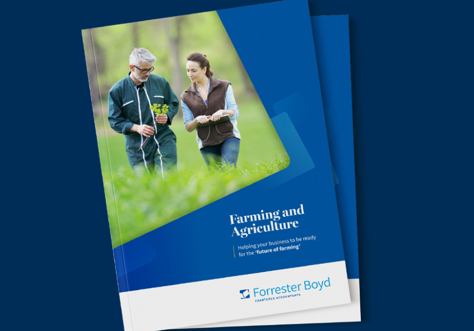
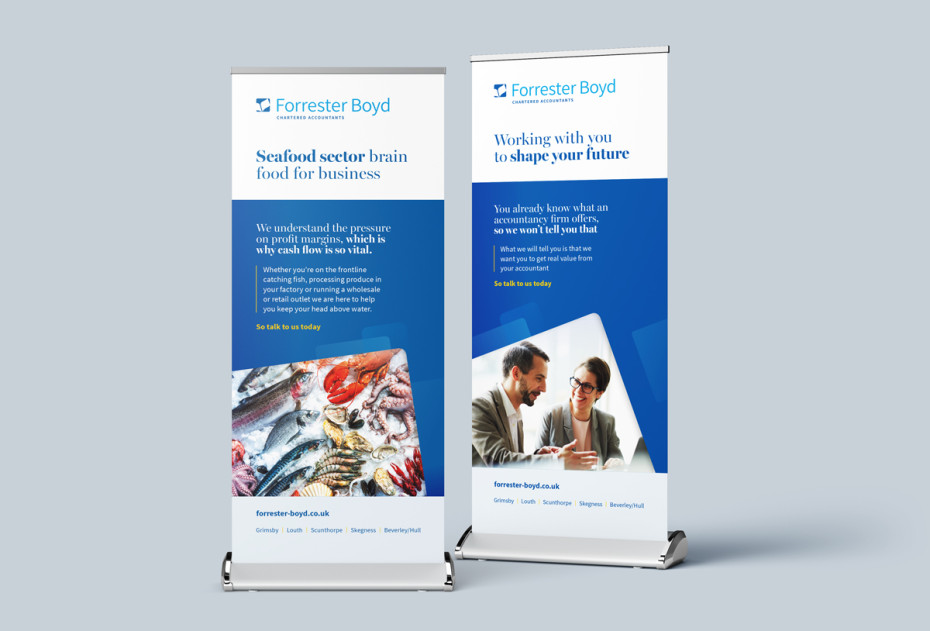
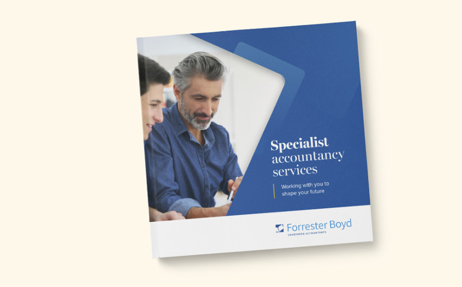
Since updating the brand we have established a close working relationship with the Forrester Boyd team and have been keeping a close eye on maintaining a consistent vision of the business across all platforms. Currently this has included an updated range of print materials including both sector and product focused collateral as well as exhibition materials and most recently a focus on their digital presence.
It's clear that our partnership has led to a refreshed approach to the Forrester Boyd brand and we're excited to see how the business develops its marketing plans over the coming months.
Thanks for reading
For more news follow us @rootstudiouk
Similar posts
Your hero image makes an impression before a single word is read. Here's the science behind why it matters and how to get it right.

Ever walked into a shop and immediately had a sales assistant on your shoulder? That tension you feel - that instinct to say "Er, just browsing thanks!" - is the hard sell doing its damage. There's a quieter, smarter way to bring clients to your door.