Article
Aug '12
Our top tips for email newsletters

Tom Bradley
Related services
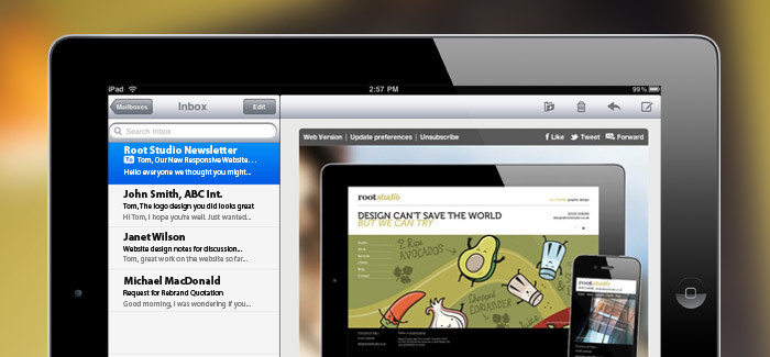
The thought of creating a HTML email template often sends a shudder down a designer's spine as it's well known to be a tricky beast. When designing a website there are a few different browsers to test for yet emails are viewed in more ways than you'd care to think about. But at Root Studio we love a challenge and would never shy away from tackling a difficult medium like email, so here's a few tips for the looks (and guts) of your email marketing.
Relationships:
People will react differently to your newsletter than with your website. Websites are purely functional in comparison - someone chooses to visit your site and wants to find what they're looking for then find their way back out without a hitch. With an email you're contacting them out of the blue and telling them personally that you have something they might be interested in. You're building a personal relationship with your contacts so make sure you reward them for signing up.
Be concise:
It's important to remember that your recipient probably hasn't been twiddling his or her thumbs desperately awaiting your next newsletter. Like you and me they will most likely spend a couple of seconds checking the header of your email and decide whether or not to continue reading or to press 'delete'. So it's important to get to the point, don't waste time cracking jokes or adding pictures of your dog wearing a paper hat. Think about why someone might be interested in your business and shout it out as clear as day. The average user spends just 51 seconds reading an email newsletter so keep it short.
Target your emails:
If you want people to read your announcements try targeting your emails to those who you think will be interested, this won't necessarily be everyone in your address book. Your contacts would rather receive one relevant message a month than 1 a week, most of which they don't care about. This way you're more likely to ensure your contacts will pay attention to what you're saying.
Measure your success:
Think about why you're sending your next email, what do you want to happen as a result of spreading the word? Perhaps drive people to a certain area of your site or to call about a certain product - this way you can measure the success of the email against your regular hits in these areas.
Don't hold your contacts hostage:
Don't hide your terms in 2pt at the bottom of your email, make it easy for those who are no longer interested in your business to escape! Making unsubscribing difficult will leave a sour taste with the uninterested - it's much better to be honest and helpful, if they want to sign up again next week they will do.
Text only versions:
It would be naive to assume that your email will be viewed in all it's glory. Quite often your email will first be displayed without images in a text only state until the readers decide they want to see what's going on. Heavily styled titles which could only be displayed as images in this case are rendered useless. Of course we would ensure that each image included a description so people would get the idea when it's hidden but it's worth bearing in mind that unfortunately some people may never see your clever pics.
Be professional:
The best way to send emails is through consistency and regularity. Make it easy for your contacts to expect an email from you (word of advice: avoid Monday mornings). More importantly make sure the style of your email reflects your business and its branding. This is where we come in. At Root Studio we have several email packages available as a monthly service ranging from around £10-40 depending on how many subscribers you have. Get in touch with us for more info.
Thanks for reading
For more news follow us @rootstudiouk
Similar posts
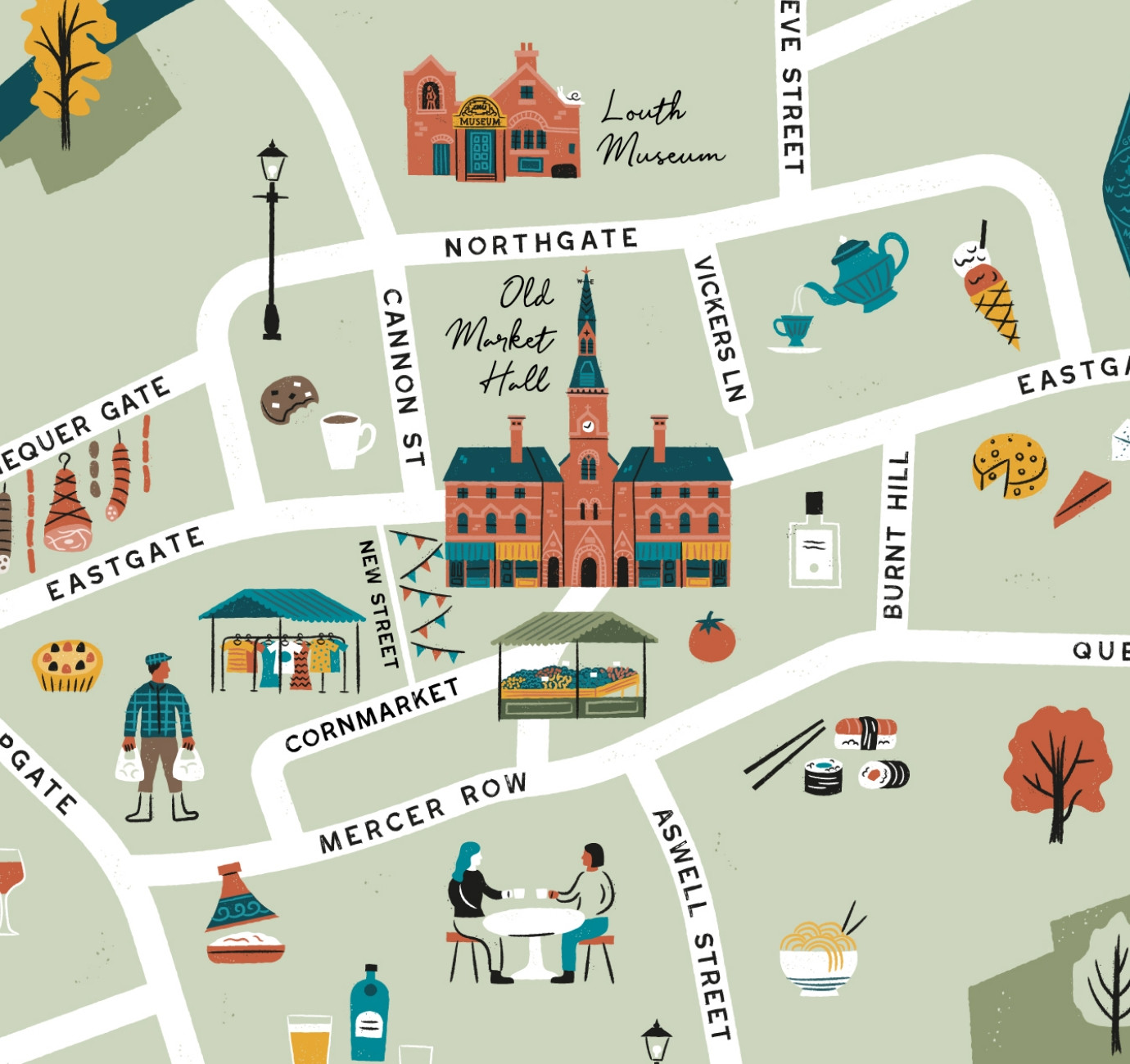
Illustrated maps can capture the essence and personality of a place, embodying its character and charm in a visually captivating way. In this article, we'll delve into the many considerations that you and your designer should make whilst crafting your illustrated visitor map.
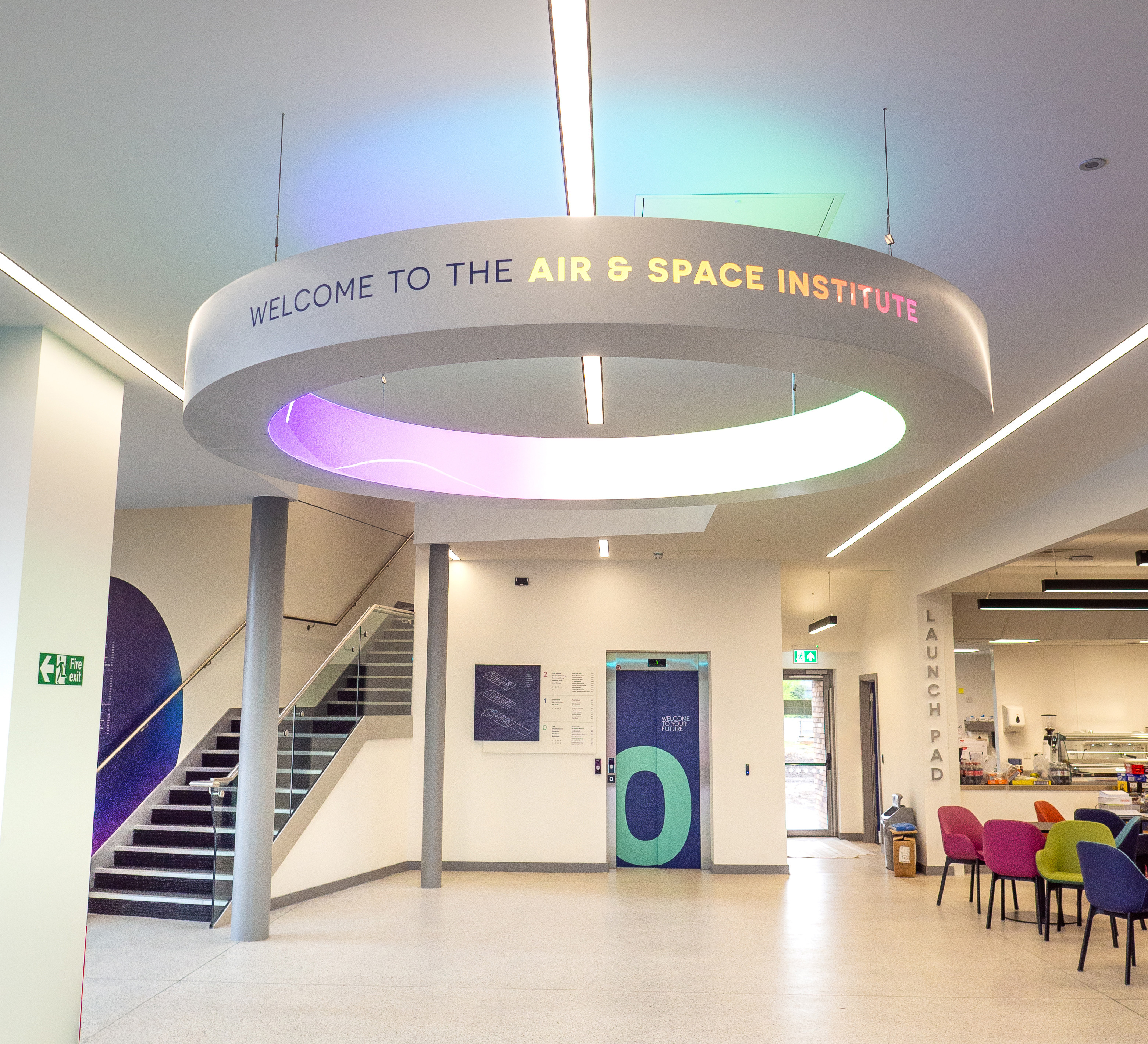
In recent months we've been working with the Lincoln College team behind the scenes at the development of their groundbreaking ASI campus in Newark to develop a cohesive and innovative collection of signage and wayfinding graphics for students, visitors and staff of the site.