Project News
Jan '21
New branding & website design for green-fingered giants, Staples Vegetables

Tom Bradley
Related services
Staples Vegetables is one of the largest growers in the country, supplying the vegetables to many of the major supermarkets in the UK. You probably have some of their products in your fridge right now.
A family run business with over 60 years of heritage to their name, Staples has a growing reputation for not only producing high quality vegetables but also for their advanced innovations in tech, sustainability and strategy. They currently deliver the highest efficiency and lowest risk in the industry and work closely with world leading seed companies to bring new and exciting flavours to the nation's tables.
Recently we worked with them to align their brand with their modern approach with a clean, minimal design that further establishes their name as representing something different to their competitors. This is the forward-thinking, ultra-professional grower at the top of the food chain.
The brief
In the past, the brand had looked to create an approachable, organic vibe that would appeal to the general public - something a little rougher around the edges, celebrating the hand made. This sort of aesthetic would be great for a consumer-focussed campaign to highlight their outstanding organic credentials however whilst Staples do have a focus on organic produce, they largely deal with large supermarket chains who are more interested in their sophisticated systems and operations. Instead, the rebrand focussed on presenting Staples, quite rightly, as an innovative market-leader, one with real, organic produce at its heart and the substance and experience to bring such quality products to the market consistently and at a massive scale.
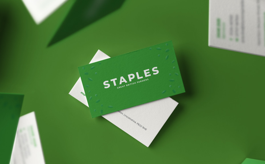
The brand
With the new logo we avoided the typical pitfalls of generic fruit and veg icons, a ploughed field or nostalgic barn graphic. Instead we looked outside of the sector for our inspiration, a sector that shares many parallels: organic, healthy, high-end and sophistication... natural cosmetic brands. These cosmetic brands pitch themselves at the higher end of the marketplace with a design that's clean and contemporary, restrained with their content but with an obvious connection to natural, healthy ingredients. Their colour palettes typically consist of pastel shades, their packaging is uncluttered and their marketing features quality photography. This was the starting point for our rebranding journey and after development, the new Staples brand was complete.

The website
For the website we reconsidered why people will be visiting - with an audience consisting of B2B clients it's unlikely that users will be looking for great recipes but more likely the fundamentals: what they grow, where, when and how. They'll want to know how Staples operate, which of their products are organic and whether their environmental credentials satisfy their own policies. They'll want to gauge their professionalism and leave convinced that the business is well-structured and fully able to supply high volumes of product to a high specification and strict schedule.
A secondary audience was potential employees, particularly with Brexit around the corner at the time. This audience would want to find out more about the company, the types of roles on offer and the lifestyle/culture at Staples. We needed to highlight available positions, allow interested parties to read up on the skills required, discover the perks and apply straight away using a simple online form.
The new website that we've produced ticks all of these boxes and more with a clean, modern design that allows Staples to stand out from the crowd. Working with our friends at Electric Egg, we also commissioned fantastic photography and video content for the site. Visit the website for yourself here.
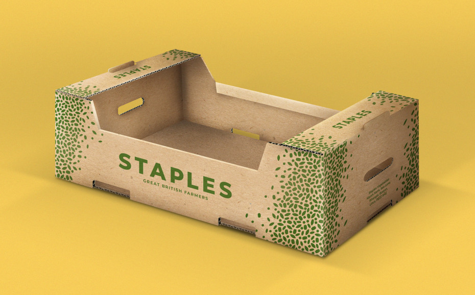
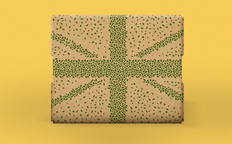
The packaging
Designing the cardboard crates for Staples was a chance to have some fun with the brand. With this part of the project we wanted to focus on Staples' growing abilities and also their proud British heritage. Our Union Jack, seed design achieves this in a subtle and playful way whilst the new logo stands proud, front and centre.
Over the years we've always enjoyed working with Staples Vegetables and look forward to seeing the new brand grow over time. If you have a project that you'd like our design and development team to help you with, give us a call.
Thanks for reading
For more news follow us @rootstudiouk
Similar posts

Your customers aren’t always comparing features, they’re secretly weighing friction. Which means your job isn’t just to sell the value - it’s to reduce the resistance. What if, instead of asking “How do we make this sound more appealing?”, we asked “What’s making this decision harder than it needs to be?”.

That first five seconds? They matter more than most people realise. But here’s the catch: when you’ve played a major role in the creative process, you’re usually too close to it to see the cracks - that's where a 5 second test comes in.