Related services
We've been busy working with the Greater Lincolnshire Nature Partnership's new branding and we're happy to finally present our labour of love.
The GLNP (formally Lincolnshire Biodiversity Partnership) co-ordinates the natural responsibilities of authorities, agencies and organisations to provide action, information and protection for biodiversity across the county of Lincolnshire.
From the offset we agreed with GLNP that this wasn't going to be another typical green nature logo, it wanted to be well-considered and tailored to the organisation's story. With this in mind we set to work creating a unique brand.
As the brand is focussed on the county of Lincolnshire we turned to the local countryside to see what inspiration it could offer. Whilst looking into native wildlife we started pulling out tones and colours that we could use to create a colour palette that was totally unique to the Lincolnshire landscape. This diverse selection of vibrant, natural colours including 'Orchid', 'Lobster', 'Barn Owl' and 'Water Vole' amongst others, was a launching pad for our branding concepts.
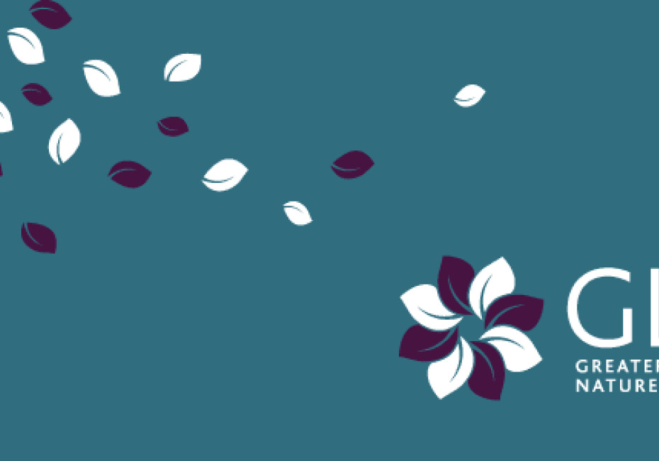
We then analysed the GLNP itself and split the general activities of the organisation into 8 workstreams, each of equal importance. This eventually led to the GLNP's new 'flower' icon, each petal representing a different sector of the business and joining together to form an octagon in the centre.
Once finalised the branding was applied to a wide range of tools ready for the launch at Doddington Hall yesterday afternoon. These tools included a stunning new website (www.glnp.org.uk) which features a wealth of information and documents concerning local biodiversity as well as natural events across the county. Supporting the website we also produced business stationery, workstream specific folders, leaflets, document templates, a powerpoint presentation template and pull-up banner displays. In short everything they needed for a running start!
It's been a great branding exercise and one that we've thoroughly enjoyed from start to finish. We'll upload more photos to our portfolio section soon.
For more news follow us @rootstudiouk
Similar posts

In a world crammed with endless scrolling, pop-ups, flashing offers and ‘read more’ rabbit holes, the real competition isn’t just other businesses - it’s cognitive overload.

Most websites don’t have a traffic problem - they have a conversion problem. Conversion Rate Optimisation (CRO) is simply about spotting issues and opportunities and gently guiding more of your visitors to take action.

