Web & Digital
Apr '26
The science behind your website’s hero image

Tom Bradley in Web Design
Related services
Within a fraction of a second of landing on a website - before you've read the headline, before you've tackled the navigation, before your brain has really done anything that could reasonably be called thinking - you've already decided whether you like it, whether it feels right and whether you're staying.
This instant reaction has just as much to do with biology as it does taste too.
So that large image sitting at the top of your page (your hero image - so called because of its importance for setting the scene) is doing something to your brain in just the tiniest of moments - and there’s a real science behind it.
This article is for people asking the following sorts of questions:
What's actually happening when someone lands on your homepage?
Why does getting the right hero image in place matter so much?
Does a hero image genuinely help? or might you be better off without one?
First impressions happen in an instant
A team of neuroscientists found that your brain processes images in as little as 13 milliseconds. Just to put that into perspective: a blink takes roughly 150 milliseconds - so your hero image is being read by the brain before you've even had a chance to blink at it!
Other studies suggest that users form an opinion about your website in around 50 milliseconds - scarily quick right? What’s more, that opinion almost never changes, even when people are given much longer to look.
So first impressions are lightning-fast and are carved in stone. Everything your visitor feels about your brand in those first moments flows from what they see right there.
That's amazing (and also a little terrifying) - either way you start to see the importance of getting that ‘above-the-fold’ (the part of your site you see first, before scrolling down) experience spot on (whilst also remembering that not everyone lands on your homepage - so these rules apply to all of the pages of your website).
What makes a hero image actually work
Emotions come first
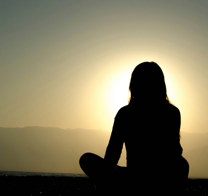
We judge things emotionally before we consider them rationally (that’s just the order in which our brains work) and images take a shortcut that bypasses conscious thought. With this in mind, your hero image really needs to reflect the feeling your brand is trying to create as it’s this feeling that your visitor is absorbing long before they start weighing up whether to trust you or take the next step.
Get the emotions right - be it warmth, authority, high-energy or calmness etc. - and the rest of your page gets to build from that solid grounding. Get it wrong however and you’ll end up fighting against that first impression for the rest of their visit.
Colour theory
The prominent colours of your hero image will also be telling their own story. Cool blues might say tech, green feels fresh, muted palettes feel more premium etc.
Just as a movie director will use colour to give a scene the right impact, you can steer the mood or genre in your favour.

The power of faces
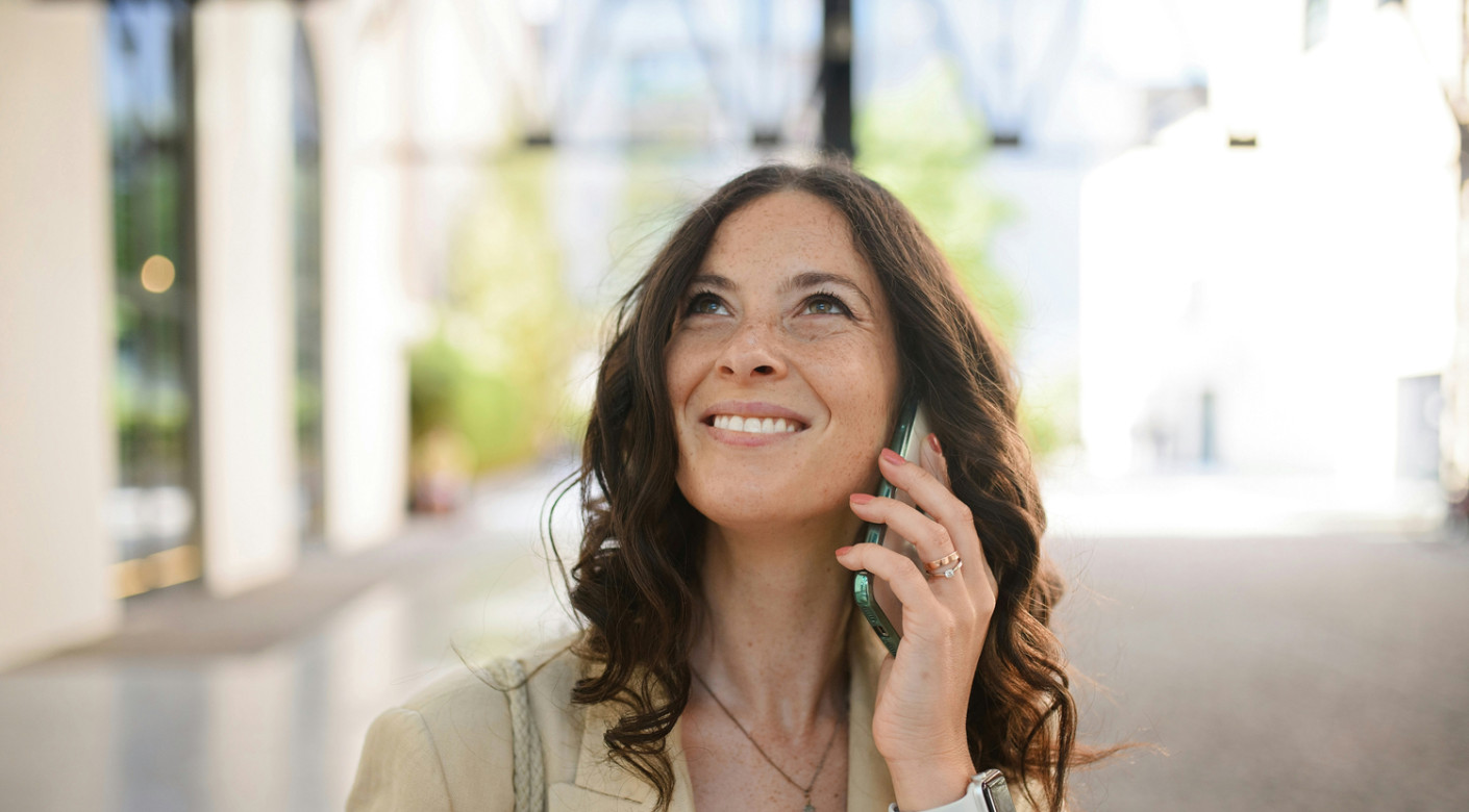
Our brains are drawn to faces like a magnet (there’s a tonne of research on the subject but for now just take my word for it!) so if your hero image includes a face - the user’s eye will head straight to it.
Interestingly, users will also follow the direction of the eyes in the image too so you need to pay attention to where that face is looking (same if they're pointing with their hands). An image of a person gazing straight back at the user holds attention on themselves whereas a person looking toward your headline or call to action subtly guides the user’s eye toward the thing you most want them to see. It's a real UX cheat code.
How your eyes scan the page
Whilst we're on the subject of eyes - eye tracking research has found that users scan web pages in an F-shaped pattern (starting top-left, moving right, then dropping down with decreasing attention as they go).
Any text overlaid on your hero image (and the visual composition itself), should work with that natural scan path rather than fight it.
Cluttered images, text in unexpected positions or visuals that pull the eye away from the headline will be fighting the natural order of things.
As we explored in another recent article on the subject of white space in design, quiet space can guide the eye just as effectively as a bold visual, so worth bearing this in mind too.
The problem with stock photos
A staged office shot, a person pointing at a whiteboard, two business people shaking hands… these images communicate almost nothing - they’re just fillers and are so familiar that they've become invisible.
A genuine photo of your actual team, an authentic product shot or perhaps a custom illustration instead of a photo can tell a visitor much more than generic imagery.
The other problem with the classic cheesy stock photo is that it plants a seed of doubt in the mind of the user right at the start of the journey - ‘do these people even exist or is this a scam?’.
Hero images and headlines
Together your hero image and headline should tell a shared story. The image should make the headline feel inevitable and the headline should make the image feel tailored, not accidental. The two need to work in tandem.
The other question to ask is whether the image is doing something that the headline can't do alone. A strong headline with breathing room and a clear call to action can be just as powerful as a full-bleed image - sometimes more so. The image earns its place when it adds something your text content can't. If it's there out of habit or to just look nice then it’s not working hard enough.
Does it pass the 3-second clarity test?
If someone who doesn't know your business glances at your homepage and can tell you what you do, who it's for and roughly why it matters - your hero is working. A 5-second test is a simple way to gather real feedback on exactly this.
The technical stuff
Your hero image and page speed
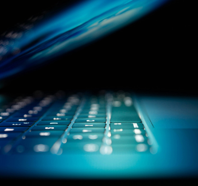
Google tracks how quickly the largest visible element on your page loads. In most cases, that element is the hero image. Google's target is 2.5 seconds or less and their research shows that bounce rates jump by 32% when load time increases from 1 second to 3 seconds.
A large, unoptimised hero image - saved at the wrong file size or in the wrong format - can do more damage to your site's performance than almost any other single component.
Mobile and video
A hero image created for a wide desktop screen can easily become a cropped, overlapping mess on a phone if not planned and tested well enough. Text that sat neatly over a clear patch of the image on desktop could sit directly over someone's face when viewed on mobile for instance and if the whole thing loads slowly on a mobile connection then you're done for.
Designing for mobile sometimes can sometimes mean uploading a completely different image for smaller screens.
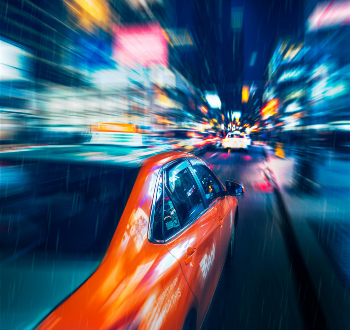
Video backgrounds can be highly engaging but the risks are amplified - they're much heavier on load time for one thing (due to their increased size). So if a still image would make the same emotional argument as a video then that should be the way to go really. The question worth asking is whether the movement is adding meaning and value to the website.
Do you even need a hero image at all?
A bold headline and a single call to action can create unparalleled focus. A page without a large hero image also loads much faster so there's definitely an argument for not including that big banner image.
Removing it could also be a great way to differentiate yourself from the rest of the market - when every website in a sector opens with the same format, the same photography style, the same layout - sometimes the best thing you can do is to take a radically different approach.
The question is a simple one: does an image genuinely communicate something that words can't? If the answer is a confident yes, then go for it. If not then maybe it’s worth a rethink.
A quick test
Pull up your website on your phone and look at the first thing you see before you scroll:
Can you tell in three seconds what the business does and who it's for?
Does the image feel unique or could it have come from a stock library?
Is anything competing for attention when it shouldn't be?
Does it load quickly or is there a lengthy delay?
If you removed the image, would the page be clearer or less clear?
There are no universally right answers here, only answers that are right for your brand and your audience.
If you'd like a fresh pair of eyes on your own website, we're always happy to take a look and have a proper conversation about what's working and what has room for improvement.
Thanks for reading
For more news follow us @rootstudiouk
Similar posts

Ever walked into a shop and immediately had a sales assistant on your shoulder? That tension you feel - that instinct to say "Er, just browsing thanks!" - is the hard sell doing its damage. There's a quieter, smarter way to bring clients to your door.

Despite the limitations with design, there are areas where AI can bring real value to the branding process. In this article, we bring you some practical tips for using AI to develop your brand.