Related services
Every now and then you have the opportunity to work on a project that you find utterly fascinating and this one had all the right ingredients: history, food and architecture.
With last year bringing delays to lots of businesses around the world, we've been waiting with anticipation to share a branding project that we created a while ago now. The Old Kings Head in Kirton is a unique building in rural Lincolnshire dating as far back as the 16th Century. With a history made up of spooky and even gruesome stories, it's future as a luxury four-star B&B and cafe will bring with it a colourful future once again as the beating heart of this historic village.
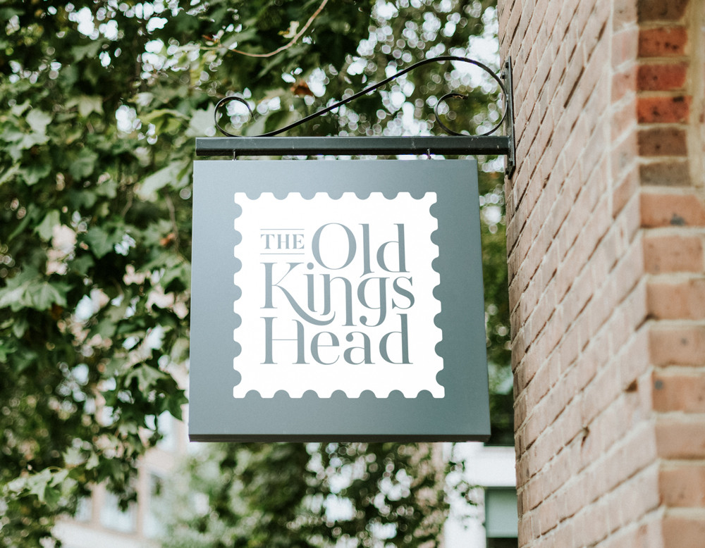
Working as a collaboration with Heritage Lincolnshire and Shooting Star, we wanted to create a brand for this new destination that would speak to those who are interested in the tales and fabric of the building as well as the families and tourists attracted to its creature comforts. We also wanted to take a fresh approach to the visualisation of a 'Kings Head' pub sign, one that didn't necessarily show a profile of a King but was more subtle and unique.
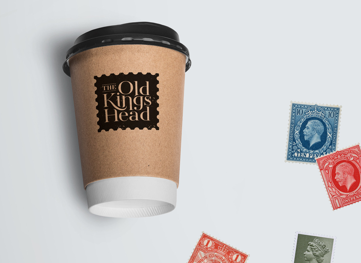
This got us thinking, 'what else would you associate with a King's head?'. So we explored carvings, wax seals, coats of arms, coinage and even playing cards until we found the answer: postage stamps. What else did stamps have going for them? They are colourful, they contain intricate artwork, they can be angled and overlapped and importantly they speak of connections and communication.
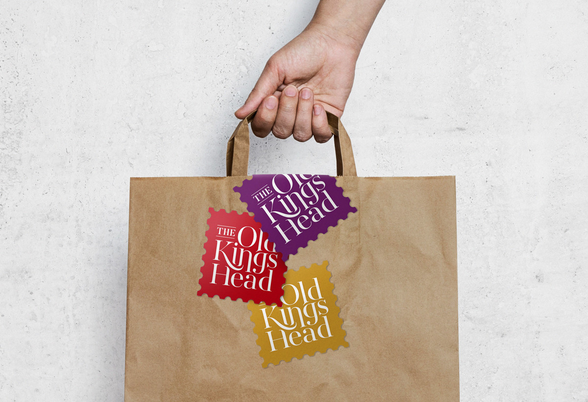
Our design went through our usual process of iteration, iteration and more iteration until we found ourselves with a logo that contained just the right amount of the contemporary and the handmade that would mirror the unique style of the building and all its hand crafted gems as well as its clean and modern reimagining.
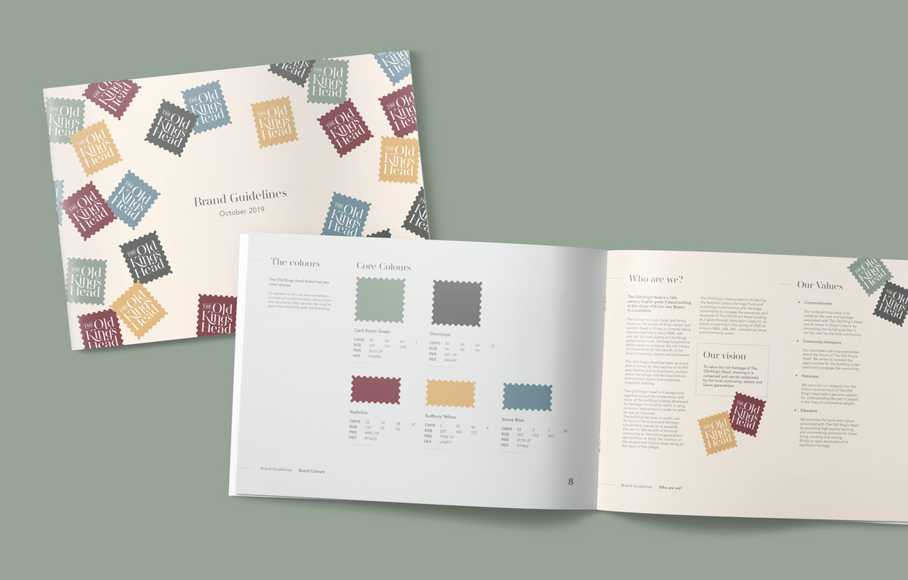
In addition to the logo design we've also created a comprehensive set of brand guidelines for the team to follow moving forward and have recently launched a small portion of the brand new website (more to come over the next few months!).
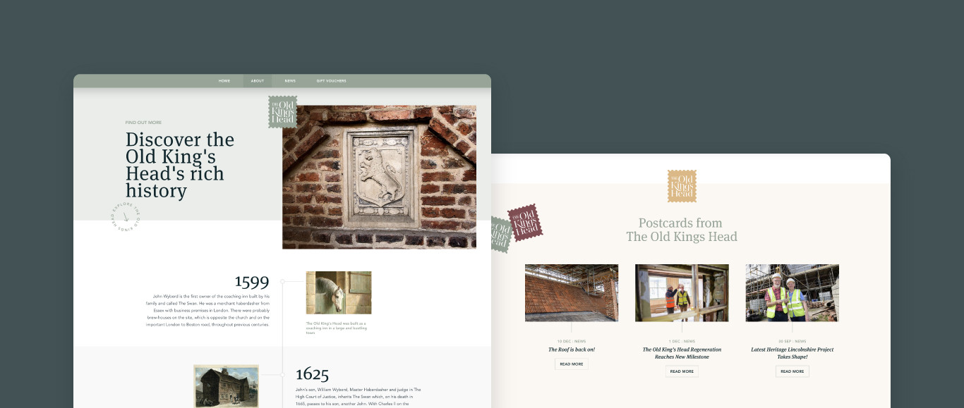
"The branding for The Old King’s Head has turned out better that we expected and really feel that it reflects the spirit of the property. We cannot wait to see the sign up outside welcoming people in for their stay or bite to eat."
Hannah Thompson from Heritage Lincolnshire
We can't wait to see the building open to the public and it's been too long since we last visited whilst the renovation was in full swing. Check out The Old Kings Head website for more details. If you have your own branding project that you would like to discuss with us please do get in touch.
For more news follow us @rootstudiouk
Similar posts
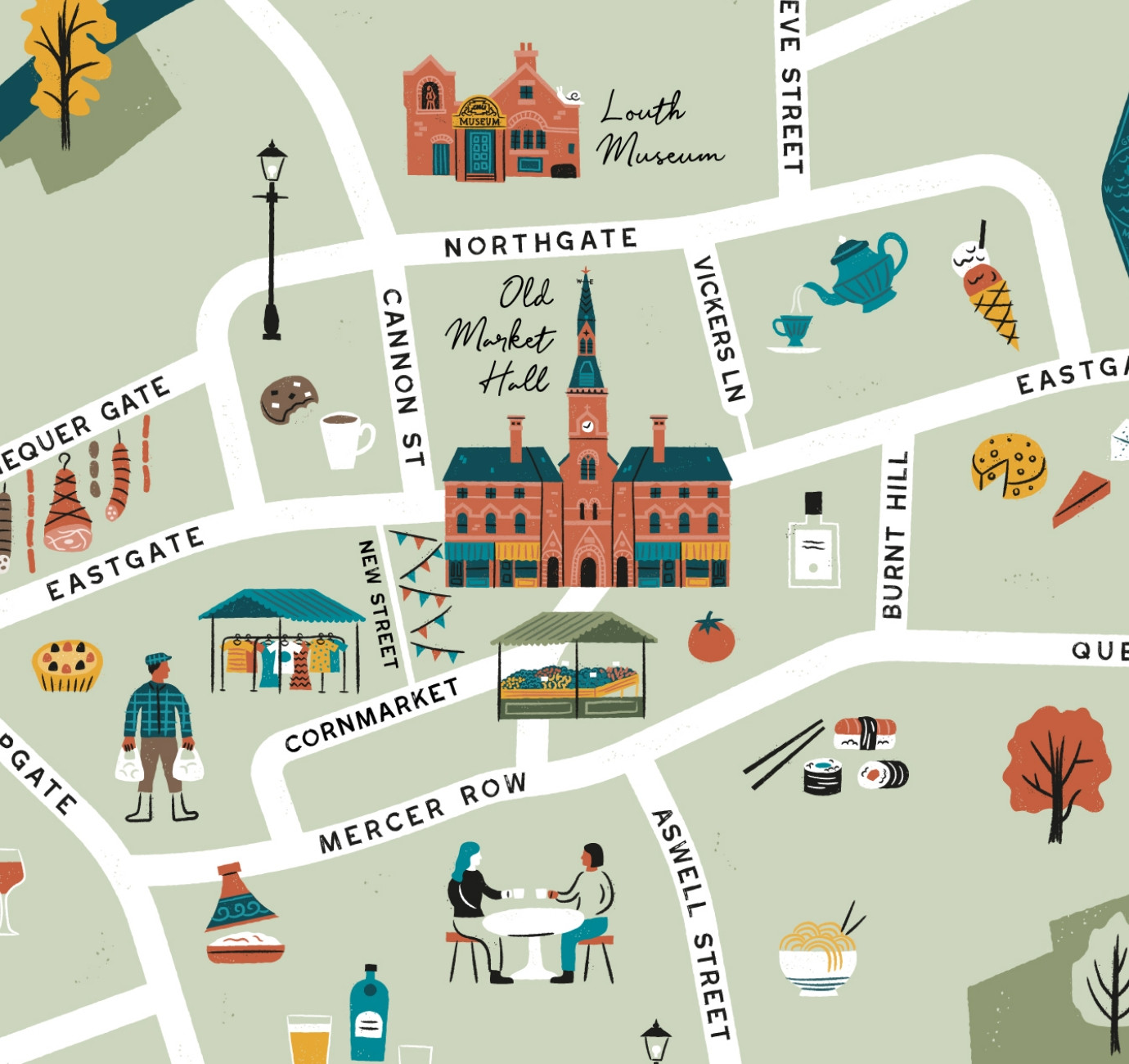
Illustrated maps can capture the essence and personality of a place, embodying its character and charm in a visually captivating way. In this article, we'll delve into the many considerations that you and your designer should make whilst crafting your illustrated visitor map.

In recent months we've been working with the Lincoln College team behind the scenes at the development of their groundbreaking ASI campus in Newark to develop a cohesive and innovative collection of signage and wayfinding graphics for students, visitors and staff of the site.

